CapeSoft.Com
Clarion Accessories
Draw
Documentation
DrawHeader
CapeSoft Logo

CapeSoft DrawHeader
Documentation

Installed Version Latest Version
Download Latest Version JumpStart FAQ History

The DrawHeader Dynamic Window Header template and class

The DrawHeader class enables you to quickly add really nice headings to your windows. Once you've added the Draw Global extension to the application, drop on the control template (called DrawHeader - Window Heading) to the window(s) that you require the draw template on, and you're done.

The DrawHeader uses the same coordinate system as the normal Draw control and a Clarion window. The control uses pixels for measurement, not dialog units.

Draw headings WOW

DrawHeader Control can be populated onto your windows to create dynamic headers:

Draw header example

Global Extension Options

Basic DrawHeader settings
Global header settings
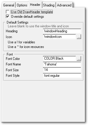
Use Old template
Uses the old DrawHeader template, which does not provide the option of modifying the behaviour at the template level and relies on the procedure imported into your application. This is not recommended except for temporary backward compatibility if you have custom code in the old imported procedure.

Override default settings
Enable this to override the class defaults and use the template to control the settings for the Header controls. These settings are all optional, leave them blank to use the defaults.

Heading
and Icon
Overrides the window heading and icon. Leave these blank to use the Window heading and icon as the defaults.

Note: The two entry fields in this section are the only entry fields which require variable names to be prepended with and exclamation mark (!) and do not require quotation marks around string literals.

Font
Override the font settings, allow the color, font name, size and style to be set. If any setting is left blank or zero, then the default values are used.

DrawHeader Shading settings
Global header shading options
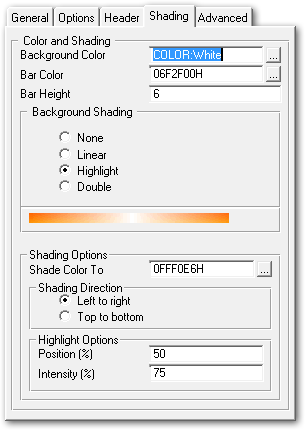
Background Color
The background color of the control, if Background Shading is enabled then this is the color that shading starts at.

Bar Color
The color for the bar that runs along the bottom of the control.

Bar Height
The height of the bar that runs along the bottom of the control, in pixels

Background Shading
Use this option to shade the background of the control in a variety of manners. The image displayed below this section indicates the style of shading select (but does not reflect the colours selected).

Shade Color To
Only applies if background shading is enabled, this is the color that will be shaded to from the background color.

Shading direction
The direction that the shading should run in (top to bottom, or left to right)

Highlight position
Only applies to Highlight and Double shading, indicates the position of the highlight on the bar.

Highlight Intensity
Indicates the intensity of the highlight, from 0 (no highlight) to 100 (pure white highlight)


DrawHeader Advanced
Global header advanced options
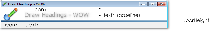
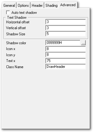
Auto text shadow
Calculates the shadow size and offset automatically based on the heading size.

Horizontal and Vertical offset
The offset for the text shadow if Auto Shadow is disabled

Shadow color
The color of the drop shadow

Icon x and y
The x and y coordinate to place the icon at on the control

Text x
The horizontal position of the heading text. The vertical position is automatically calculated to ensure the text is always centered in the control vertically.

Class Name
Specified the class to use for this object. Use this to override the default class and use a custom class for creating the header.

Local Extension Options

The local extension is identical to the Global extension, except that in order to use the local settings you need to tick the "Override Global Settings" checkbox. By default the control will use the Global settings.

Upgrading from the old DrawHeader template and procedure from version prior to 2.63

The settings are now all accessible via the Global Draw extension, and can also be overridden using the local extension. By default the new template and class will be used, however the old template (which uses the imported headings procedure) can still be used by ticking the box on the global extension (to use the old template and procedure for all headers), or on the local extension (to use the old template and procedure for a specific header).

Some of the new features of the DrawHeader class:
For the class methods and properties please see the Class Reference.

Examples

There is an example of the Dynamic header in the Clarion\3rdparty\Example\Draw\Headings directory.

The dynamic header template allows you to easily add a title to a window that dynamically renders a drop shadows title and icon. By default the window title and icon are used, but these can easily be customized in the template settings.

Draw header example

Options for old control template (on the actions tab of the control properties)

All the options can be left as default (blank) and the Window title and icon will be used, or you can customise the look and feel as required.

DrawHeader Class Methods and Properties

The DrawHeader class is new in Draw 2.63 and expands the Draw Header features as well as providing an object that allows the header to be easily controlled and modified.

DrawHeader inherits from Draw, and contains all of the properties and methods of the Draw object. This document covers those methods that override the behaviour of the Draw methods (although all call the parent method).

DrawHeader Methods
ChangeIconChange the icon being used by the control at runtime.
DisplayRenders the header and displays it
InitInitialize the class and settings.
ResizeResizes the header and displays it
KillDeallocates memory and cleans up

Class Methods

ChangeIcon

ChangeIcon (string iconName)

Description

Changes the icon being used for the header at runtime.

Parameters
Parameter Description
iconNameA string that contains the name of the icon to use. Can be the name of an icon file on disk, or an internal icon using the standard Clarion syntax of a tilde to indicate a project resource: '~MyIcon.ico'
Returns

None

Display

Display () Description

Description

Displays the header using the current settings. Called automatically when the control is resized, so after calling Resize() it is not necessary to call Display().

Resize

Resize ()

Description

Resizes the control - if the control height has manually been changed or the window is wider than the control's width, then the control is resized and redrawn. By default the control is set to resize horizontally, but not vertically. The control will automatically be set to twice the window width on resize, which minimizes the number of times that the control needs to be redrawn to improve performance. The control will not be resized if the window size is reduced.

Init

Init (ulong pControl)

Description

Initializes the control with the default settings and stores the image control handle that will be used to display the header. This calls the parent Draw Init(0 method.

Kill

Kill ()

Description

Cleans up the control and all allocated resources.

Class Properties

These properties are used to determine how the heading will be drawn. They can be overridden manually, or by using the template. The values must be set before the call to Display in order to effect the header. The properties can also be changed in the fly and Display() called in order to dynamically update the header.
DrawHeader Properties
displayText string(2048)
textX long
textY long
blurSize long
autoShadow long
shadowOffsetX long
shadowOffsetY long
shadowColor long
iconName string(280)
bgColor long
bgColorEnd long
shadeType long
shadeDirection long
highlightPos long
highlightIntensity long
iconHandle Ulong
iconX long
iconY long
iconSize long  
barStartColor long
barEndColor long
barHeight long
resizePercentagelong
displayText string(2048)The actual text to display. By default the Init methods sets this to the Window title. This can be set at any point before a call to Display().
textX long Position to display the heading at. The Init() method sets this to a default value.
textY long The position to display the heading text at. The Init method sets this based on the height of the control, the size of the font and the size of the bottom bar (of any) to ensure that the text is always centered in the control. This position is in pixels from the top of the control, and represents the baseline (not the top) of the text. The baseline is the line that each letter is placed onto, letter such as p and g drop below the baseline.
blurSize longThe size of the "blur" for the drop shadow or glow around the text. If the autoShadow property is set then the Display() method calculates this based on the font size.
autoShadow longIf set the shadow size and offsets are done automatically.
shadowOffsetX long The number of pixels to offset the shadow horizontally.  If the autoShadow property is set then the Display() method calculates this based on the font size.
shadowOffsetY long The number of pixels to offset the shadow vertically.  If the autoShadow property is set then the Display() method calculates this based on the font size.
shadowColor long The color for the drop shadow.
iconName string(280) The name of the icon to use, can be a resource, or blank.
bgColor longThe background color.
bgColorEnd long A second background color for gradients.
shadeType long The type of shading. Can be set to 0 for a solid color, or one of the following equates:
Draw:LinearShade equate(1) - Shades from bgColor to bgColorEnd.
Draw:SingleShade equate(2) - Shades from bgColor to bgColorEnd with a highlight as specified by the .highlightPos property.
Draw:DoubleShade equate(4) - Similar to SingleShade but the color gradient is perpendicular to the shading direction.

The shading is determined by the shadeType and shadeDirection parameters.
shadeDirection long Sets the shading to vertical or horizontal can be set to one of:
Draw:Horizontal equate(0)
Draw:Vertical equate(1)
highlightPos long The position of a highlight for shading types that use one.
highlightIntensity long The intensity of the highlight if one is used.
iconHandle UlongThe handle of the icon to draw. The DrawHeader class will automatically fetch he icon from a resource and allocate this handle. It can be allocate manually by calling the Draw.GetIconHandle() directly to load a particular icon either from disk or from a resource.
iconX long The position to display the icon at horizontally, from the left hand side of the control.
iconY   longThe position to display the icon at vertically, from the top of the control
iconSize long   The default size for the icon, defaults to 48x48 pixels if the control is large enough, otherwise a smaller icon is selected by the Display() method.
barStartColor long Color used for the bar along the bottom of the control.
barEndColor long End color (for shading) of the bar drawn along the bottom.
barHeight long The height (in pixels) of the bar across the bottom. The Init() method sets this to 5 pixels by default.
resizePercentage long Allows the resize width of the bar to be adjusted. By default this is 100, which creates a bar twice as wide as the current width of the window, allowing the window size to be increased without having to redraw the bar frequently. Setting this to 0 always draws the bar the same width as the window, and values in between allow a balance between performance and appearance. We don't recommend values above 100, although there is no limit on the value.