NetTalk WebServer - Mobile Browsers
Introduction
The goal with the mobile support in NetTalk is to allow you to create a
single web application, which adjusts itself to the user device, while
giving you as the developer the maximum amount of control, with the least
amount of work. This is a work-in-progress, and this part of NetTalk is
expected to grow, and change, during the NetTalk life cycle.
The
goal of this document is to discuss the specific features and behaviors that
apply to NetTalk from a mobile perspective.
What is Mobile?
There are a few approaches one can take when discussing mobile. The most
obvious starting point is screen-size. Phones, for example, have screens a
lot smaller than desktop PC's, and this is something that needs to be
handled. Another difference is the use of "touch" as an interface, rather
than a mouse and keyboard. This demands slightly different user interface
approaches - for example in a touch interface there is no concept of "mouse
hover". Lastly there is the issue of native-app replacement. Many mobile
apps, targeted at mobile platforms will fulfill the role of a "native app"
meaning that at least to some extent a similar interface style to native
apps are desired.
Even from these three criteria, it becomes apparent
that some devices do not easily categorize themselves as either "mobile" or
"desktop". A 10-inch tablet for example has a large screen, seemingly
placing it in the desktop space, but uses a touch interface.
It
should be note that normal desktop sites written with NetTalk 5 (and NetTalk
6) appear to work perfectly well on tablet devices. A long-term strategy not
to rely on right-mouse abilities, or mouse-hover abilities means that there
is no obviously functionality lost when browsing any NetTalk site with a
tablet. Thus the introduction of Mobile support in NetTalk focuses mainly on
smaller devices, such as phones.
From a design perspective the small
screen on the device becomes the overriding factor. This lack of space
determines a lot about how the page will look. For example, all unnecessary
information should be removed. Where a typical site has a fairly large
header section, and possible a footer section as well, these will likely be
removed completely, or dramatically reduced in the mobile version.
How is Mobile Chosen
There are three basic methods for detecting (and deciding) if a device is
"mobile" or not. The first is to consider the User-Agent field of the
incoming request. This can usually identify the device with some certainty,
and is a good starting point. However, over time, User-Agent fields are
bound to change, and of course nothing prevents a device from lying. The
second approach is to use JavaScript to determine the capabilities of the
device - and this works well too, although not all devices necessarily
respond in the same way. The third approach is to let the user decide. This
is an important back-stop. You should always have a mechanism for the user
to force the site into either mobile, or desktop mode.
NetTalk uses
all three approaches, although the last usually requires some interface
intervention on the part of the developer. Typically this might occur on the
login screen (a drop-down letting them choose) or it might be tied to a site
subdomain (mobile.capesoft.com as distinct from www.capesoft.com). By
default a user can force himself into (or out of) a mobile session by using
the parameter
?_mobile_=1 or
?_mobile_=0 with any request. (The setting is
remembered for future requests in that session).
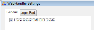
If you wish you can
force your site into mobile mode at compile time. This is useful during
development as it allows you to concentrate on the mobile experience,
without leaving your desktop. This is done in the WebHandler procedure, On
the WebHandler Settings.
Recommended Building and Testing
During the building and testing phase, the ideal browser to use on the
desktop is Google's Chrome. This most closely matches the browsers in both
iOS and Android devices. We usually test in both FireFox (for it's debugging
and CSS editing abilities) and Chrome to see what the final effect will be.
Of course you will definitely want one or more devices to test with as well.
At the bare minimum you will need either an Android, or an iOS phone for
testing. If you can access more than one device then that will be better,
especially as you get closer to deployment.
Upgrade from NetTalk 5 Checklist
If you have an existing NetTalk 5 application, then the following steps will prepare it
to quickly support the new mobile features. Note that each step is described in
more detail elsewhere in this document.
Recommended
- Go to the Web Server procedure, To the NetTalk Extensions,
Settings / Buttons tab. Refresh all the buttons there (by deleting
them all). (See Buttons)
- Go to the Header and Footer procedures. Make sure they have
their Header and Footer attributes set on. (See
Headers and Footers)
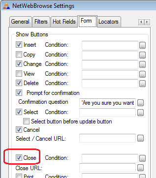
- Make sure all Browses have a Close button. (See
Browse Close Buttons)
Optional
- Carefully check Header and Footer HTML to make sure it's
optimized for mobile, when in mobile mode. (See Headers and Footers)
- Remove unnecessary columns from Browse while in Mobile mode. Add
In-Line Change buttons (on the right) and perhaps In-Line Delete
buttons (on the left) of each browse row. Change and Delete buttons
below the browse can then be removed.
WebServer Settings
Some settings have been added to the WebServer procedure, which allow you to
turn off, or modify mobile behavior.
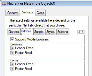
When
Headers and Footers are fixed (the default) then the page will scroll within
the header, and footer areas. If they are not fixed then the page will
scroll and the header and/or footer will only be visible when the user is at
the top, or bottom of the page.
The Buttons on the Settings / Buttons
tab also have additional options for each of the standard buttons. If you
have not changed any of the settings o your buttons, then the easiest way to
refresh the list is simply to Delete all the buttons from the list. when you
delete a button it is re-added, to the bottom of the list, with the default
settings for that button. So when you see the top button reappear (typically
the "Upload" button) then you know you've done them all.
Notice
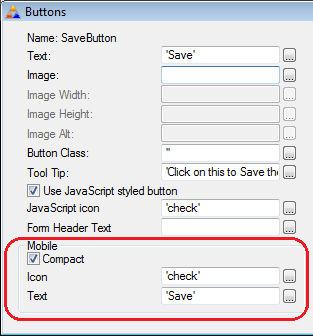
the new "Mobile" settings available for each button.
Compact: If this is on the button will be as
small as possible. If set off, then the button will take up the entire width
of the screen.
Icon: The name of the
jQueryMobile icon to use for this button. Note that this isn't the same as a
normal jQuery icon.
Text: The text to
appear on the button.
Browses
BBecause of the limited screen space, the menu is not shown in every
screen. Therefore it becomes important that the user can navigate
forwards, and backwards, without the need for a menu. To this end, it is
strongly encouraged that all browse procedures have their "Close" button
enabled. Remember if you want to limit the Close button to the mobile
environment, then you can set the Close Condition to not p_web.IsMobile()
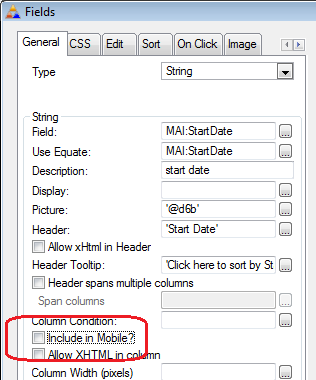
In the mobile version of your app you will want to reduce the number of
columns on most browses significantly. While this can be done by setting
the Column Condition to
not p_web.IsMobile()
a better way is to tick off the template option
Include In
Mobile.
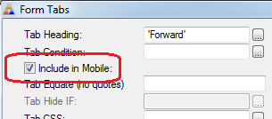
Forms
Like the browse columns, Tabs can also be removed from mobile versions,
by using the
Include in Mobile switch.
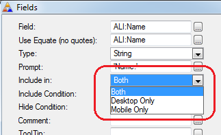
Fields can be linked to Desktop, Mobile, or Both. Ideally you should
limit forms to as few fields as possible when in mobile mode,
concentrating on those fields which will most benefit from being
editable while on the move.
p_web.IsMobile()
The key new method in NetTalk is the IsMobile() method. This returns true if
the current request is from a mobile device. This method will come in useful
wherever you want to change mobile behavior from desktop behavior. For
example on a form, some tabs or menu items may not appear in mobile mode,
and so on. Used in conjunction with the Clarion CHOOSE command, you have a
powerful inline decision making tool. For example, say you wanted to apply
one css style to an item in mobile mode, and another in desktop mode. Then
the following css setting would apply;
CHOOSE(p_web.IsMobile(),'some-mobile-class','some-desktop-class')
In some places the above code is simplified with a template options, and
in other cases different behavior is already programmed into the application
by default - those cases
will be covered later in this document.
xHTML
Because of the smaller nature of the mobile screen, many of your existing
xHtml tabs will need to be considered. Two additional settings have been
added to the xHTML tab in all the templates;
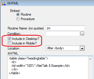
This allows you to determine which xHTML appears on desktop browsers, and
which appear on Mobile devices. Your goal in most cases will be to reduce
the clutter as much as possible in the mobile case. The above xHtml contains
a typical header section, complete with an HTML table. The following is a
simplified version, tailored to Mobile;
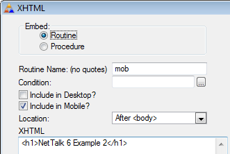
Note
the use of the HTML <h1> tag. This tag is recommended for mobile headers, as
it will affect the default styling of the header.
Headers and Footers
The section above
alludes to the changes you will want to make on all your NetWebSource
procedures (as well as any other procedures with xHTML additions.) However
the PageHeaderTag and PageFooterTag procedures deserve a special mention.
Firstly these procedures appear across the whole site, so simplifying
them will make a dramatic difference to the screen space available
everywhere else. In addition to this however the concept of a Header, and
Footer, is understood by the styling, and so identifying your Header and
Footer procedures becomes very important. To this end make sure that the
headings on the General tab are entered correctly.
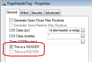
Notice
also that on NetWebSource procedures you can use a different CSS class for
mobile, and desktop.
Menus
NetTalk supports two basic menu types, a horizontal one (best typified by
the DoubleDrop option) and the vertical one (best typified by the TaskPanel
option.) NetTalk 6 adds a third type of menu, the menu for Mobile. In
NetTalk 5 and earlier you had to decide on the menu type at design time,
however in NetTalk 6 the menu can now be selected at runtime. This means
that when the application is in mobile mode, then the mobile menu type is
automatically selected for you and the vertical, or horizontal menu is not
displayed.
Another difference is that the menu is not included on
every page. Web sites are a lot more "modal" in nature, each step (menu,
browse, form etc) tends to use the whole screen. Users can navigate
backwards, but their ability to completely jump around is reduced (not
removed completely, just reduced).
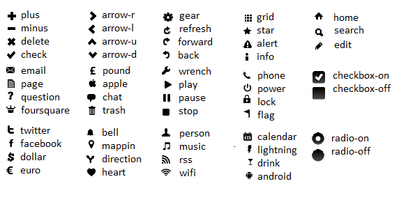
Icons
NetTalk ships with a default set of icons for mobile use. These are based on the
shipping jQueryMobile icons, and supplemented with icons from
andyMatthews.Net. The available icons, with their names are;
Troubleshooting
My App won't switch to Mobile Mode
You app should swap to Mobile mode if one of the conditions for mobile are met. If it doesn't, here are some things
to check.
- WebServer Procedure - Make sure the "Support Mobile Browsers" option is on (Mobile Tab).
- WebHandler Procedure - Make sure the "Set site mode to" option is set to Detect.
- WebServer Procedure - If you want tablets (especially high resolution tablets) to automatically switch to mobile, set the "Max Mobile Res" option to a high number (in excess of 2500)
[End of this document]
