When it comes to angles, Draw uses a co-ordinate
system similar to a normal math co-ordinate system. In this system angles
are measured anti-clockwise from 3 o'clock, so 3 o'clock is 0 degrees, 12
o'clock is 90 degrees and so on.
Most speedometers use a clock-wise motion to indicate higher values, and
the resting zero value is at 6 o'clock.
In order to make the Gauge classes easier to use, the coordinate system
for angles is the Speedometer one, not the Draw one. A method (used
internally) called
ConvertAngle is provided
to convert from the Gauge coordinate system to the Draw coordinate system.
All angles are measured in tenths of a degree. In other words a value of
900 = 90 degrees.
A call to the method SetNeedleRange determines the minimum and maximum
angles for the needle. It also specifies the maximum and minimum values
for the gauge. This allows you to use the SetNeedleValue method (and not
worry about angles at all) whenever the value changes.
A gauge consists of the background and the needle. The
background in turn consists of circles, tick marks at various points on
the circles, and text labels for some or all of the tick marks. You can
also specify a center spot, a title for the gauge and a displayable value.

The circle can consist of multiple parts, where each part may have a
different color or width. Ticks can be placed at any point on (or near)
the circle, and the ticks can be labeled or left unlabeled.
A number of methods (
AddCircle,
AddTicks,
AddTick) are provided to allow these background
parts to be easily defined, and added to the gauge.
The background color of the gauge is set via the property called
BackgroundColor.
Various other properties set the position, and look, of the Title and
Value components. Almost all the items are of course completely optional -
a gauge could be reduced to simply a needle.
In addition the whole Draw drawing class is available, including all
low-level drawing methods, so the background can be drawn onto with any
Draw method. A method (
DrawCustom) is provided
for any extra draw commands that you may wish to add to the background.
A gauge consists of the background (circles, ticks,
labels and so on) and the needle.
To change the value of the needle you can call a method called
DrawNeedle.
If your value for the needle is a variable with the
LONG data type then you can set the gauge to simply monitor that
value. If the value changes then the gauge will automatically move its own
needle as soon as an event happens on the window. For example, if the
needle should monitor
loc:progress then the
code looks something like this;
gauge.NeedleValuePtr &= loc:progress
Use the
SetNeedleRange method when setting
up the gauge to set the minimum and maximum values, which in turn allows
the class to convert the values into angles internally.
The look of the needle itself is determined by a number of properties.
The width of the needle (in pixels) and the color of the needle are set
via
NeedleWidth and
NeedleColor respectivly.
The
NeedleOffset determines where the needle
ends. A value of 0 will end the needle on the outer edge of the circle. If
this number is greater than 0 then it will extend beyond the edge of the
circle by that many pixels. And if it is less than zero then it will end
inside the circle by that many pixels. So, for example, if it is set to
-10, and the width of the circle is 5, then the needle will end 5 pixels
short of the circle's inner edge.
The
NeedleLength property determines how
long the needle is. If it is set to 0 then it will be drawn to the circle
edge, taking the offset into account. The gauge circle may not be round
(the shape of the image control determines the shape of the circle) so the
needle may be a different length depending on where in the circle it is.
If the length is set to a value other than zero, then the length will be
fixed to that amount, regardless of the shape of the circle.
Background Layer
The background layer sits at the bottom of the
drawing. The other layers are drawn on top of this one. You can use and
Draw method to draw on this layer. for example;
gauge.WithLayer(self.BackgroundLayer)
gauge.SetPenColor(color:red)
gauge.SetPenWidth(1)
gauge.Box(self.gx,self.gy,self.gw,self.gh)
Dynamic Layer
The dynamic layer is reserved for all the components
that have to be redrawn when the value of the gauge changes. So, for
example, on a Circular gauge the dynamic layer holds the needle and the
text value. If you draw on this layer then you need to also draw the
same components on the DynamicAlpha layer, in color:black.
For example;
gauge.WithLayer(self.DynamicLayer)
gauge.SetFontColor(color:red)
gauge.SetFontStyle(font:bold)
gauge.Show(self.gx,self.gy,'!')
gauge.WithLayer(self.DynamicAlphaLayer)
gauge.SetFontcolor(color:black)
gauge.Show(self.gx,self.gy,'!')
Top Layer
The top layer sits on top of the dynamic layer, but
it contains items that do not need to be redrawn when the value changes.
For example, in a circular gauge the center spot is above the needle,
and hence is on the top layer. If you draw on this layer then you also
need to draw the same item on the TopAlpha layer, in the color black.
For example;
gauge.WithLayer(self.TopLayer)
gauge.SetPenColor(color:green)
gauge.Line(self.gx,self.gy,self.gw,self.gh)
gauge.WithLayer(self.TopAlphaLayer)
gauge.SetPenColor(color:black)
gauge.Line(self.gx,self.gy,self.gw,self.gh)
A gauge consists of a background (which can include
circles, parts of circles, tick marks and labels) plus a needle for
showing the current value. Here is an annotated example if setting up such
a gauge.
gauge.Start()
All gauges should start with a call to Start. This refreshes the object an
makes it easier to use one object to display multiple gauges.
gauge.SetPadding(10,10,10,10,true)
The padding is the gap between the gauge and the edge of the control.
these are percentage values, so in this case a 10% gap all around the
gauge is maintained. In this example a fifth parameter indicates that the
gauge is a semi-circle, not a full circle.
gauge.AddCircle (900,2000,color:Green,25)
gauge.AddCircle (2000,2700,color:Maroon,25)
These lines add two Arcs to the background of the gauge. The first
parameter is the start angle and the second is the end angle. Remember
these are in tenths of a degree. The third parameter is the color. The
final parameter is the width of the circle line.
gauge.AddTicks(900,2700,100,color:black,3,-35,10)
Multiple tick marks can be added to the gauge with a single call. In this
case a small tick mark is placed around the edge of the circle every 10
degrees. (From 90 degress to 270 degrees, every 10 degrees, add a tick
mark in black, with a width of 3 pixels. The ticks should be inside the
(outside of the) circle by 35 pixels and each tick should be 10 pixels
long.
gauge.AddTicks(900,2700,400,color:black,5,-35,20,'0~10~20~30~40~50',-70)
You can overwrite existing ticks with new values. In this case every
fourth tick is being reset. the tick is wider (5 pixels), and longer (20
pixels). In addition these ticks are being labeled (using a tilde
separated list) and are located at an offset of -70 to the outside of the
circle.
needle = gauge.MinAngle
gauge.DrawGauge(needle)
The gauge is complete, and can be draw with the desired needle location.
The needle is measured in tenths of a degree. The property .MinAngle
contains the minimum angle of the circle (in this case 90 degrees) and the .MaxAngle property contains the maximum angle of
the circle (in this case 270 degrees).
If the value of the needle needs to change then simple call
gauge.DrawNeedle(needle)
The DrawGauge class is derived from the Draw class,
and all the methods and properties in that class are in scope here.
The DrawGaugeCircle class is derived from the the DrawGauge class, and so
all the properties and the methods from DrawGauge (and Draw) classes are
in scope in the DrawGaugeCircle Class.
| DrawGuage Methods |
| Bounds |
Sets the boundaries for the gauge based on the current size of
the Image control. |
| Design |
A method where all the components of the gauge design can be
done in one place. |
| DrawCustom |
An empty method, provided to make custom drawing on the gauge
possible. |
| DrawCustomBackground |
An empty method, provided to make custom drawing on the gauge
possible. |
| DrawTitle |
Draws the title on the gauge. Do not call directly, call DrawGauge
instead. |
| DrawValueText |
Draws the value text on the gauge. |
| DrawGauge |
Draw and display the whole gauge (Circles, Ticks, Labels, Title,
Value and Needle) |
| Init |
Called to initialize the object to the Image control on the
window. |
| Resize |
Call when the size of the Image control changes - this resets
the object to match the new size. |
| SetPadding |
Sets the padding percentage |
| Start |
Called before you start using the object. This restores the
object to "clean" initial settings, especially useful if you are
reusing the object to display a completely different gauge. |
| TakeEvent |
Responds to any events (like Event:DoResize)
which may require the gauge to respond. |
| ValueToText |
Allows for custom formatting of the value into text. |
| DrawGuageCircle Methods |
| AddCircle |
Add a circle (or part of a circle) to the background of the
gauge. |
| AddTick |
Add a tick mark to the edge of the gauge. |
| AddTicks |
Add multiple ticks to the edge of the gauge. |
| ConvertAngle |
Convert an angle from the Gauge coordinate system to the Draw
coordinate system. |
| DrawCenter |
Draws the center spot of the gauge on the top layer. |
| DrawCircles |
Draw all the circles on the background. |
| DrawNeedle |
Redraw just the needle on the gauge. This is called as the value
of the gauge changes. |
| DrawTicks |
Draw all the ticks around the edge of the circles. |
| DrawTickLabel |
Draw all the labels on the gauge. |
| SetNeedleRange |
Sets the range for the needle. |
| SetNeedleValue |
Sets the value of the needle to a specific value. The needle is
not drawn. Not usually called directly, use DrawNeedle instead. |
AddCircle
AddCircle(LONG
pStart, LONG pEnd, LONG pFillColor, LONG pWidth, LONG pOffset)
Description
Adds a circle, or circle segment to the gauge. A gauge can have multiple
circle segments, so that different parts of the circle can be in
different colors or different widths.
Parameters
| Parameter |
Description |
| pStart |
The start angle of the circle segment. This value is in the
range 0 through 3600. Angles are measured in tenths of a degree
clockwise, from 6 o'clock. |
| pEnd |
The end angle of the circle segment. This
value is in the range 0 through 3600. Angles are measured in
tenths of a degree clockwise, from 6 o'clock. |
| pFillColor |
The color of the segment. |
| pWidth |
The width (in pixels) of the segment. |
| pOffset |
The distance (in pixels) from the outer edge of this circle,
to the outer edge of the gauge. For example this is 0 for a
circle on the edge of the gauge, and 10 for a circle which is
inside the gauge by 10 pixels. |
Returns
Nothing
Remarks
Examples
This picture
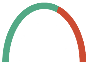
is achieved with the following two calls;
gauge.AddCircle (900,2000,0085A952h,25,0)
gauge.AddCircle (2000,2700,00324BCCh,25,0)
See Also
AddTick,
AddTicks,
DrawGauge
AddTick
AddTick(LONG
pAngle, LONG pColor, LONG pWidth, LONG pOffset, LONG pLength,
<String pLabel>, LONG pLabelOffset=0, LONG pFontSize=-1, LONG
pFontColor=color:none)
Description
Adds a tick mark to the circle.
Parameters
| Parameter |
Description |
| pAngle |
The angle, in tenths of a degree (900 = 90 degrees) where the
tick should appear. Angles are measured clockwise, from 6
o'clock. |
| pColor |
The color of the tick. |
| pWidth |
The width (in pixels) of the tick. |
| pOffset |
The offset of the tick, in pixels, from the outer edge of the
circle. A value of 0 means the tick will be draw from the outer
edge of the circle towards the center of the circle. A value
greater than 0 moves the tick outwards, away from the center, a
value < 0 moves the tick inwards towards the center. |
| pLength |
The length of the tick mark in pixels. |
| pLabel [optional] |
The label to add to the tick mark. If omitted the label is
not added to the tick. |
| pLabelOffset [optional] |
The offset of the center of the label, in pixels, from the
outer edge of the circle. If omitted the value is 0. |
| pFontSize [optional] |
The size of the font to use. If omitted the window font size
is used. |
| pFontColor [optional] |
the color of the font. If omitted, or set to color:none
then the window font color is used. |
Returns
Nothing
Remarks
Examples
gauge.AddTick(900,color:black,5,-35,20,'10',-70)
See Also
AddTicks,
DrawGauge
AddTicks
AddTicks(LONG
pFromAngle, LONG pToAngle, LONG pBy, LONG pColor, LONG pWidth, LONG
pOffset, LONG pLength, <String pLabel>, LONG pLabelOffset=0,
LONG pFontSize=-1, LONG pFontColor=color:none)
Description
Adds multiple tick marks to the circle at the same time. The parameters
are (mostly) the same as for the
AddTick method,
however instead of a single angle a range of angles (and a step value)
can be set here.
Parameters
| Parameter |
Description |
| pFromAngle |
The starting angle, in tenths of a degree (900 = 90 degrees). |
| pToAngle |
The ending angle, in tenths of a degree (2700 = 270 degrees). |
| pBy |
The step value between ticks. (100 = every 10 degrees) |
| pLabel |
A tilde ( ~ ) separated list containing the labels for the
ticks. If this parameter contains more labels than ticks then
excess labels are simply ignored. If there are fewer labels,
then the later ticks will have a blank label. If this parameter
is omitted then all the labels are blank. |
| |
See the AddTick method for a
description of the other parameters. |
Returns
Nothing
Remarks
Existing ticks can be changed using this method.
Examples
gauge.AddTicks(900,2700,100,color:black,3,-35,10)
gauge.AddTicks(900,2700,400,color:black,5,-35,20,'0~10~20~30~40~50',-70)
See Also
AddTick,
DrawGauge
Bounds
Bounds()
Description
Sets the gx, gy, gw and gh properties to indicate the boundaries of the
drawing area, based on the current values in the LeftPadding,
RightPadding, TopPadding and BottomPadding properties and taking into
account the current size of the image control. Sets the cx and cy
properties to the center of the gauge - the place where the needle
originates from.
Returns
Nothing
Remarks
Usually called internally when either the padding changes (via
SetPadding)
or the size of the control changes (via Resize).
See Also
SetPadding
Design
Design(LONG
pDesign=0)
Description
This is a method which is provided as a convenient place to put all the
calls to
SetPadding,
AddCircle,
AddTicks,
AddTick and
SetNeedlAngle that are required to set the
"look" of the gauge.
Parameters
| Parameter |
Description |
| pDesign [optional] |
An optional parameter that allows you to include multiple
designs in your method, and then use this parameter to switch
between them. The DrawGaugeCircle class includes five built-in
designs, DrawGauge:ProgressStyle, DrawGauge:ResourceStyle, DrawGauge:AudioStyle,
DrawGauge:SpeedometerStyle and DrawGauge:LowHigh. |
Returns
Nothing
Remarks
The template puts all the code which determines the "look" of the gauge
into this method.
Example
self.SetPadding(10,10,10,10,true)
self.AddCircle (900,2000,0085A952h,25) ! green
self.AddCircle (2000,2700,00324BCCh,25) ! red
self.AddTicks(900,2700,100,color:black,3,-35,10)
self.AddTicks(900,2700,400,color:black,5,-35,20,'0~10~20~30~40~50',-70)
self.SetNeedleAngle(self.MinAngle)
See Also
AddCircle,
AddTicks,
AddTick,
SetNeedleAngle
ConvertAngle
ConvertAngle(LONG
pAngle)
Description
Converts an angle from the gauge frame of reference (clockwise from 6
o'clock) to the Draw frame of reference (anti-clockwise from 3 o'clock.)
This is used internally where necessary. All gauge methods (described in
the document) use the gauge frame of reference for angle values, but the
other draw methods (including inherited methods which take angles) use
the Draw frame of reference.
Parameters
| Parameter |
Description |
| pAngle |
The angle value, in tenths of a degree to convert. |
Returns
The angle suitable for use with the Draw methods which use a frame of
reference starting at 3 o'clock and incrementing anti-clockwise.
Remarks
The reason for the difference in frames-of-reference is that gauges work
universally by incrementing in a clockwise direction. It is a lot easier
to draw circles and ticks if you are using this reference.
Examples
a = self.ConvertAngle(0) a = self.ConvertAngle(900)
a = self.ConvertAngle(1800)
a = self.ConvertAngle(2700)
See Also
DrawCenter
DrawCenter()
Description
Draws the center spot of the circle.
Returns
Nothing
Remarks
The properties
CenterColor and
CenterRadius
are used to determine the color and size of the spot
respectively. The center is drawn onto the top layer, so is above the
needle.
this method is not usually called directly, use
DrawGauge instead.
See Also
DrawGauge
DrawCircles
DrawCircles()
Description
Draws the circles added by one or more calls to
AddCircle. Called internally from
DrawGauge.
The drawing is not cleared before the circles are drawn.
Returns
Nothing
Remarks
Not usually called directly - use
DrawGauge
instead.
See Also
AddCircle,
DrawGauge
DrawCustom
DrawCustom()
Description
This method provides a convenient place to embed custom drawing
functions on the gauge
after the circles, ticks and
title are drawn.
Since the DrawGauge class is derived from the Draw class, all the
drawing functions available in Draw are also available in DrawGauge. If
you wish to add custom drawing routines then this is a good place to add
them.
Returns
Nothing
Examples
self.SetPencolor(color:maroon)
self.Ellipse(self.cx - 5, self.cy - 5, 10, 10)
self.SetPencolor(color:green)
self.SetPenWidth(3)
self.box(3,3,self.width-3,self.height-3)
See Also
DrawGauge,
DrawCustomBackground
DrawCustomBackground
DrawCustomBackground()
Description
This method provides a convenient place to embed custom drawing
functions on the gauge,
before all the other background
items are drawn. This is a good place to load a background image for the
gauge, or to draw items which will be "behind" the circles, ticks and
title.
Since the DrawGauge class is derived from the Draw class, all the
drawing functions available in Draw are also available in DrawGauge.
Returns
Nothing
Examples
self.WithLayer(self.BackgroundLayer)
self.diReadImage('background.png',0,0)
See Also
DrawGauge,
DrawCustom
DrawTitle
DrawTitle()
Description
Draws the Title on the gauage.
Returns
Nothing
Remarks
If the
ShowTitle property is false, then
the title is not displayed. This method does not clear the existing
title from the gauge and hence is not usually called directly. Use
DrawGauge
instead.
See Also
DrawGauge
DrawValueText
DrawValueText(<String
pValue>)
Description
This method draws the value text
Parameters
| Parameter |
Description |
| pValue |
The formatted text to display. |
Returns
Nothing
Remarks
This value is called from
DrawNeedle, and is
not usually called directly. The properties
ValueX,
ValueY,
ValueW
and
ValueH are updated when this method is
called.
See Also
DrawNeedle
DrawGauge
DrawGauge(<LONG
pValue>)
Description
Clears the drawing surface (to
self.backgroundcolor), then draws the circles, ticks, labels,
title, vlaue and needle. The needle can then be moved, and the value
updated, using calls to
DrawNeedle.
Parameters
| Parameter |
Description |
| pValue [optional] |
The value to set the needle to. This should be in the range
between self.MinimumValue and self.MaximumValue. If omitted then the
current value of Self.NeedleAngle
is used. |
Returns
Nothing
Remarks
Once the gauge has been created (by calls to
AddCircle,
AddTicks and
AddTick)
then it can be drawn using this method. If a static part of the gauge
changes (circles, ticks, title, center, custom) then call this method to
redraw the gauge.
Examples
See Also
AddCircle,
AddTicks,
AddTick,
DrawNeedle,
DrawCustom
DrawNeedle
DrawNeedle(<LONG
pValue>)
Description
This draws (or redraws) the position of the needle on the gauge. Call
this method anytime that the need value changes. The width of the needle
is determined by the
NeedleWidth
property, the color of the needle is determined by the
NeedleColor
property, and the offset of the needle is determined by the
NeedleOffset property, the length of the
needle is determined by the
NeedleLength property.
Parameters
| Parameter |
Description |
| pValue [optional] |
The value of the needle to draw. If omitted then the current
value of Self.NeedleAngle is used.
|
Returns
Nothing
Remarks
Internally the gauge is constructed using layers. Since the needle is
draw to its own layer, redrawing the needle does not result in a redraw
of the whole gauge. Thus custom drawing on the gauge itself does not
need to be redone when a needle value changes.
Examples
ThisGauge.DrawNeedle(progress)
See Also
AddCircle,
AddTicks,
AddTick,
DrawNeedle
DrawTicks
DrawTicks()
Description
Draws the ticks added by one or more calls to
AddTicks or AddTick. Called
internally from
DrawGauge. The drawing is not
cleared before the ticks are drawn.
Returns
Nothing
Remarks
Not usually called directly - use
DrawGauge
instead.
See Also
DrawGauge
DrawTickLabel
DrawTickLabel()
Description
Draws a tick label added by one or more calls to
AddTicks
or
AddTick. Called internally from
DrawTicks. The drawing is not cleared
before the label is drawn.
Returns
Nothing
Remarks
Not usually called directly - use
DrawGauge
instead.
SSee Also
DrawGuage
Init
Init(LONG Control)
Description
Initializes the object to an image control on the window.
Parameters
| Parameter |
Description |
| Control |
The use equate of an image control on the window. |
Returns
Nothing
Examples
ThisGauge.Init(?SomeImage)
See Also
Start
Resize
Resize()
Description
Resets the boundaries of the gauge based on the current size of the
image control. Can be called after an image control is resized. Is
called automatically (via
TakeEvent) on an
event:DoResize.
Returns
Nothing
Examples
self.resize()
SetPadding
SetPadding(Long
pLeft, Long pRight, Long pTop, Long pBottom, Long pSemi=false)
Description
Sets the padding around the gauge to allow for some space between the
edge of the gauge circles and the edge of the control. Note that this
does not apply to tick marks, or labels, only the circle itself. All
values are measured as a percentage of the control width and height.
Parameters
| Parameter |
Description |
| pLeft |
The percentage value to use for the left edge of the gauge. |
| pRight |
The percentage value to use for the left edge of the gauge. |
| pTop |
The percentage value to use for the left edge of the gauge. |
| pBottom |
The percentage value to use for the left edge of the gauge. |
| pSemi |
If set to false then the gauge is a full-circle gauge. If set
to true then only angles from 900 to 2700 will be possible on
the gauge. |
Returns
Nothing
Remarks
Internally calls the
Bounds method to set the gx,
gy, gw and gh properties.
Examples
self.setPadding(10,10,5,5,false)
See Also
Bounds
SetNeedleRange
SetNeedleRange(LONG
pMinAngle, LONG pMaxAngle, REAL pMinValue, REAL pMaxValue)
Description
Sets the value of the needle. This method does not draw the needle. To
set the needle, and draw it, use the
DrawNeedle
method instead.
Parameters
| Parameter |
Description |
| pMinAngle |
The minimum angle for the gauge. Angles are measure in tenths
of a degree, from 6 o'clock. Valid values are 0 through 3600. |
| pMaxAngle |
The maximum angle for the gauge. |
| pMinValue |
The minimum value for the gauge. |
| pMaxValue |
The maximum value for the gauge. |
Returns
Nothing
Remarks
A fair number of the other methods use these properties either directly,
or indirectly, so getting this call correct is important. By setting the
ranges for the Angles, and Values, correctly the needle position can be
correctly calculated when the value changes.
See Also
DrawNeedle
SetNeedleValue
SetNeedleValue(LONG
pValue)
Description
Sets the value of the needle. This method does not draw the needle. To
set the needle, and draw it, use the
DrawNeedle
method instead.
Parameters
| Parameter |
Description |
| pValue |
The new value of the needle. |
Returns
Nothing
Remarks
Once the gauge has been drawn, and is visible, then the needle should be
updated with a call to
DrawNeedle. However
this method can be used to set the initial needle value when the gauge
is being constructed.
This method calculates the new angle for the needle. If this angle is
less than
self.Minangle then the needle
is set to
self.MinAngle. If this value is
greater than
self.MaxAngle then the needle
is set to
self.MaxAngle.
See Also
DrawNeedle
Start
Start()
Description
Returns the object back to the point as if it has just been created.
This allows a single object to be reused, without there being
side-effects from previous uses of the object.
Returns
Nothing
Remarks
This method should be used if you allow the user to change the look or
style of the gauge at runtime. Rather than trying to undo earlier
settings (circles, ticks, labels and so on) the object can be "cleaned"
back to the original state simply by calling this method.
EEExamples
self.start()
TakeEvent
TakeEvent()
Description
This method call should be added to your event loop for the window. It
allows the gauge control to respond to events
Returns
0 if event processing should continue for this event. If not 0 then
processing for this event should not continue.
Remarks
Responds to
EVENT:DoResize events on the
window to redraw the gauge. This method does not resize the gauge
control.
Examples
If ThisGuage.TakeEvent() then cycle.
See Also
Resize
ValueToText
ValueToText(Long
pValue)
Description
Generates the text version of the value, based on the number. By default
applies the
ValuePicture property to the
value.
Parameters
| Parameter |
Description |
| pValue |
The value to be formatted |
Returns
String. The formatted value.
Remarks
This is a good place to embed code if the formatting of the value
requires more than the application of a single clarion picture.
Examples
self.start()
