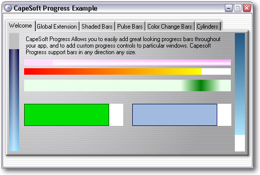
Introduction


The CapeSoft Progress control allows you to use custom progress
controls, which provide a variety of different shading and style options.
In addition it allows real-time previewing of any changes. No hand coding
is required to use the progress control, and replacing all existing
progress controls in your app is as simple as adding a global extension.
CapeSoft
Progress is built on the fast, robust
CapeSoft Draw
engine,
and is shipped as source code, hence you need CapeSoft Draw in order to
use Progress. See the
Draw
Page for more information on CapeSoft Draw.
Installation
Please install
CapeSoft Draw 2.14 or higher before using CapeSoft
Progress. Run the supplied installation file.
Important: CapeSoft Progress
requires
CapeSoft Draw (4.22 or later), without Draw it
will not function. Please insure that you have CapeSoft Draw installed
before using Progress.
What's New (Important)
- Progress requires Draw 4.22 or later
Clarion 11.0.13622 required the Draw class to be renamed (from Draw to
DrawClass.) Regardless of which version you are using, Progress now
requires Draw 4.22 or later.
Jump Start
Using CapeSoft Progress in your program is really
easy. This quick start is divided into two sections. The first section
covers using CapeSoft Progress to replace all the existing controls in an
application using the global template. The second section covers adding a
single progress control to a window.
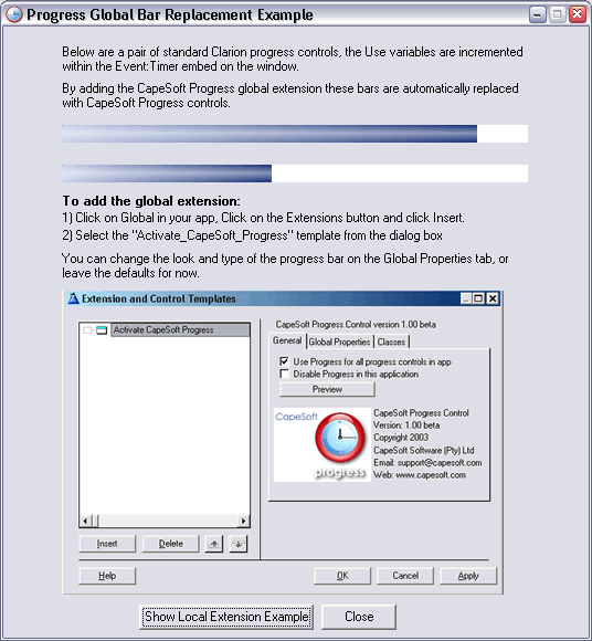
Adding Progress to an existing application (Globally)
CapeSoft Progress makes it exceptionally easy to
replace all the boring old Progress bars in your application with spiffy
new Progress controls.
- Open an existing application (for example the app that ships with
progress in your 3rdparty\examples\progress\global\ directory)
- Go to the global extensions for the app (Click on the "Global"
button and the click "Extensions")
- Click on "Insert" and choose "Progress - Activate CapeSoft's
Progress.
- That's it! You can use the default settings, click OK until you
get back to the app and compile and run the app.
Hint: Each window procedure that uses
progress controls will have a local progress extension added to it, you
can use this to override the global settings for that individual
procedure.
Adding a Single Progress Control
- Create a new Application and make the main procedure a Window
(alternatively you can use the single.app file in your
clarion\3rdparty\examples\progress\single\ directory)
- Right click on the Window procedure and click "Data". Add a long
called "curProgress". This is the variable that the control will use
to update itself.
- In the Window Editor place a new progress control on the window
and select "CapeSoft Progress Control" from the populate options
box. Resize the control to the size you prefer.
- Right click on the control and choose "Properties". This is where
you can configure all the setting for this Progress control:
- Set the Use attribute to curProgress - the variable you added to
the procedure earlier.
- Click on the "Actions" tab and then on the "Properties" sub tab
- This shows all the current setting for the progress bar, you can
leave these as the default value for now.
- Click OK and then save your changes to the window.
- Compile and run the application.
- You can change the look of the progress control by right clicking
on the control and choosing "Actions", then clicking on the
"Properties" tab. See the section on progress bar
properties for more information.
Note: When using PROP to get the runtime
properties of the control, do no use the Clarion control handle, for
example:
myWidth = ?myProgress{ PROP:Width}
may return the incorrect value for the width of the control. Instead you
should use the
thisProgress.control property to
access runtime properties. Example:
progressWidth = thisProgress.control{PROP:Width}
progressXPos = thisProgress.control{PROP:Xpos}
If you set the PROP values using the Clarion progress control handle
then the Progress object will update itself, and in doing so may
overwrite the properties of the Clarion control. This only applies to
{PROP:Width}, {PROP:Height}, {PROP:Xpos} and {PROP:Ypos}.
Example
There is an example in your
\Clarion\3rdParty\Examples\Progress\Demo directory. The example is a great
way to get started and see a few of the ways you can use CapeSoft
Progress.
In addition there are two simple examples of using Progress: Global.app
and Single.app. They are in the Examples\Progress\JumpStart and
Examples\Progress\Single directories respectively.
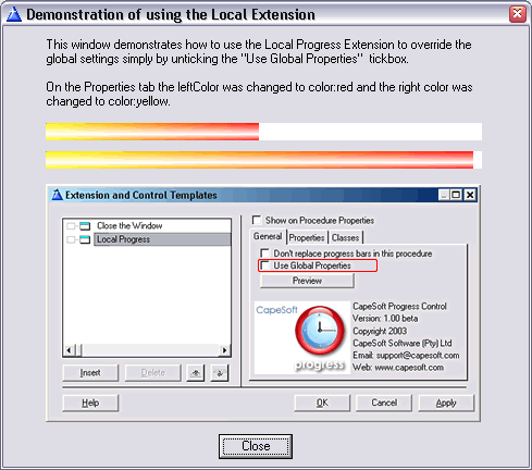
Global
The global.app example demonstrate how you use
Progress to override existing progress controls simply by adding the
global extension and leaving the "Replace all progress controls" tickbox
checked (which it is by default). It also demonstrates unchecking the
"Use Global Properties" checkbox on the Local Progress Extension in
order to override the progress control properties for that particular
procedure.
Single
The single.app example demonstrates adding a single
CapeSoft Progress control to a window, it is essentially the result of
following the JumpStart guide for adding a single custom progress
control to a window.
Adding Progress to Your Application
Adding a CapeSoft Progress to your application is
easy. If you would like to replace all the progress controls in your
application with CapeSoft progress controls then add the Global Progress
Extension (see 1. below). You can also simply add a CapeSoft Progress
control to your window (see 2. below).
1) Adding the global Progress extension:
- Open the global properties for your app, and click on the
"extensions" button.
- Click on the "Insert" button and choose "Active CapeSoft Progress".
- You can now set the properties for all progress controls in your
app. See the section on the Global Extension
for more information.
- By default Progress replaces all existing progress controls in your
app with CapeSoft Progress controls, you can uncheck the "Use Progress
for all progress control in app" tickbox if you would prefer to place
individual progress controls. Even if this checkbox is ticked, you
still create custom progress control by adding a CapeSoft Progress
Control to a window. See the Local Extension
Template for more information.
2) Adding a custom progress control to a window
- Open the window editor for the window
- Place a progress control on the window
- Select CapeSoft Progress Control from the
template populate box
- Right click on the control and choose Properties, then click on the
Actions tab. You can set all the options for the control here, see the
section on the Local Extension Template for
more information.
- Hint: The best way to get to terms
with the options available is to click on the "Preview" button on the
General tab to see the effects of your changes in real time.
Important: When using PROP to get the
runtime properties of the control, do no use the Clarion control handle,
for example:
myWidth = ?myProgress{
PROP:Width}
may return the incorrect value for the width of the control. Instead you
should use the
thisProgress.control property to
access runtime properties.
Example:
myWidth = thisProgress.control{PROP:Width}
myXPos = thisProgress.control{PROP:Xpos}
If you set the PROP values using the Clarion progress control handle then
the Progress object will update itself, and in doing so may overwrite the
properties of the Clarion control. This only applies to {PROP:Width},
{PROP:Height}, {PROP:Xpos} and {PROP:Ypos}.
Updating Progress inside a loop
In most cases the Progress control will be updated
automatically, however when a bar needs to be updated inside a loop (such
as looping through a number of records) it is necessary to manually update
the progress bar in order for it to be displayed.
- When updating a progress control inside a tight loop, you will need
to call the SetProgress() method followed
by Display() in order to update and display the control.
Example:
loop i = 1 to
Records(myQueue)
Get(myQueue, i)
myFile.id = myQueue.id
if Access:myFile.Insert()
end
thisProgress_p1.SetProgress(i)
Display(thisProgress_p1.control)
end
Using Progress in Multi-DLL applications
Draw and Progress provide options on the global extension to make using
Draw and Progress in multi DLL applications simple.
For the Data DLL you need to add the global extension, and for every other
app file
that uses Draw and Progress exported from that DLL, you should add the the
global extension and tick the "Use Draw that is
exported in another DLL" option.
If you are not familiar with Multi-DLL development, or you need
to create a new Multi-DLL from scratch rather than adding the extensions
to
existing applications the steps are as follows:
Data DLL
- Add the global extensions
- Compile the data DLL
Note: The "Use Draw (and Progress)
that is exported in another DLL" settings on the template must
be unticked for Draw and Progress in the data DLL (the DLL that they
are being exported from)
Main APP
- Add the global extensions
- On both the Draw and Progress global extensions tick the "Use Draw
(and Progress) that is exported in another DLL" tick boxes
- From the Application menu choose "Insert Module"
- Choose "External DLL"
- Click on the Lookup button next to the Name field and select the
LIB file for your data DLL. Click OK.
The Multi-DLL example in the \3rdparty\examples\Progress\ folder in
your Clarion directory demonstrates this.
Optimising Performance
Versions of Progress prior to 1.11 used a "Double
Shaded" progress bar as the default bar type. This type of bar calculates
the shading per pixels, for every pixel on the progress bar, every time
the bar is redrawn. Progress 1.11 changes the default bar type to a Block
Bar, which dramatically increases the performance and only needs to be
drawn once. Block Bars also have the advantage that they can be based on
any type of shaded bar, simply create a shaded bar and set the blockBar
property to 1.
FAQ
- Do I need to purchase CapeSoft Draw?
Yes, CapeSoft Progress uses CapeSoft Draw, which allows us to ship
both Draw and Progress as source code. Progress is an example of a few
of the many features which Draw allows you to add to applications.
This also means that Progress is fully customizable and extensible.
For more about CapeSoft Draw visit the Draw page at the CapeSoft web site. Question 4
and 5 are the most frequently asked questions about Progress.
- I get the compile error "Make error: Source
file Draw.clw not found".
Progress requires CapeSoft
Draw, please make sure you have Draw installed before compiling
your app.
- When I compile I get a number of errors of the
form "unknown field self.baseLayer."
You have an old version of Draw, Progress requires CapeSoft Draw 2.14
or later. See the CapeSoft
Draw page for the latest version of Draw.
- The progress bar doesn't get displayed - it is
just blank.
See the section on Updating Progress Inside a
Loop
- The Progress bar looks good, but it seems to slow
processing down, how can I make it faster?
See the section on Optimising Progress
- One of my progress controls just doesn't seem to
behave, what can I do?
Email  and please include the parameters that
you have set (such as the various colors, draw directions etc. You can
simply send JPEG, GIF or PNG screen shots of the settings tabs if you
prefer), we will whip the slack progress control into shape ASAP and
send you an update.
and please include the parameters that
you have set (such as the various colors, draw directions etc. You can
simply send JPEG, GIF or PNG screen shots of the settings tabs if you
prefer), we will whip the slack progress control into shape ASAP and
send you an update.
- I really want a super nifty polka dot progress
control, what can I do?
Progress is fully extensible, so you can add as many progress bar
types as you like (by modifying the Display() method), alternatively
Email and we will add it to the list of
supported progress bars, as well as adding it to the real time
previewer and template options.
Support
Your questions, comments and suggestions are welcome. Check our web page
(www.capesoft.com/accessories/downloads.htm)
for new versions. You can also contact us in one of the following ways:
| CapeSoft Support |
| Email |
|
| Telephone |
+27 87 828 0123 |
Distribution
CapeSoft Progress ships as pure Clarion source code, so you can simply
compile
and ship your application, with no external resources necessary for
Progress.
The Global Progress Extension
See
Adding Progress to your
Application for information on how to add the Global Extension. The
global extension allows you to set the defaults for all CapeSoft progress
controls that you populate, as well as allowing you to change all the
existing progress controls to CapeSoft progress controls (and set the
options that the controls will use). The global and local extension have
identical options, with the exception of the Global "General" tab which
allows you to use Progress globally, or disable Progress globally. Once
you have added this to your app each Window that uses Clarion progress
bars or CapeSoft Progress bars will have a local template that allows you
to override the global setting on a procedure level. On the local template
the "Use global settings" box is ticked by default, untick this box to use
the setting on the Properties tab of this extension for the procedure.
Global General Template
 Use Progress for all progress control in app
:
This allows you to use CapeSoft progress to replace all the existing
Clarion progress controls in your app. The controls will use the global
properties specified on the other tabs.
Disable Progress in this application:
Disables all Progress code, useful for debugging to ascertain whether an
issue is being caused by Progress.
Preview Button:
This allows you to modify the global setting for Progress, and
see the result immediately displayed on a progress control. See the
section on The Preview Button for more information.
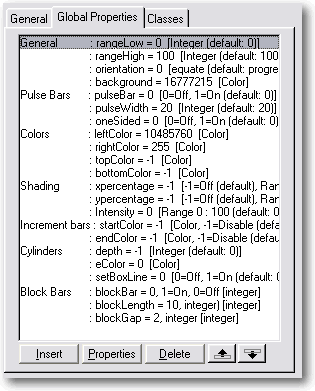
Global Properties Tab
 RangeHigh and RangeLow
The maximum and minimum values for the progress control. By default
these are set to zero and 100.
Orientation
The direction the progress control should increment in. The default is
progress:right, which draws a progress bar the
same as the normal Clarion bar (starting at the left hand side of the
control and moving right as the bar increases in length). Progress also
allows you to set this to
progress:left;
progress:up or
progress:down,
to create bars that draw in any direction.
Note: See the section on
Types
of Progress Bars for information and examples of the effects of
the various settings below.
Pulse Bar
Changes the Progress Control into a "Pulse" bar. Setting this to 1 will
override any other settings that might apply (shading and incremental
settings will be ignored).
Pulse Width
The width of the "Pulse" that runs down the pulse bar.
OneSided
Specifies that the pulse bar fades to the one side.
LeftColor
Basic color for the bar, also used as the left hand color in shaded
bars.
RightColor/TopColor/BottomColor
Colors used for shading
xpercentage/ypercentage
Horizontal and vertical percentage across the bar for the highlight on
shaded bars.
intensity
The highlight intensity
startColor and endColor
The start and end colors for bars which change color as they progress,
setting these to values other than -1 will override any shading options
specified. If you change the startColor and endColor after the call to
progress.Init() make sure you set the Init property to zero, this will
recalculate the color increments with the new color specified. See
Incremental Bars for more information and an example.
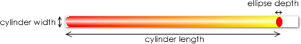
depth/eColor
Depth specifies the depth (in pixels) of the ellipse on the end of
cylinders (if this is -1 or zero then the bar will not be drawn as a
cylinder), the ellipse will be drawn in eColor. Depth should be less
than the width of the cylinder, so for instance for a progress bar that
is ten pixels high a depth of 6 or 8 should work well.
Note that cylinders can only be drawn with a shading type that draws the
highlight down the length of the cylinder, so top to bottom shading with
no highlight, or left to right shading with a highlight (ypercentage
> 0).
setBoxLine
By default a line is drawn in startColor around incremental
progress bars, setting this to 1 will ensure than no line is drawn
around the bar.
blockBar
Breaks the current bar into blocks (like the normal Windows progress
bar):

Block bars use the shading settings to draw the bar once and then copy
it block by block from a hidden Draw layer. If you change the shading
options manually (i.e. you are hand coding the progress bar) make sure
that you set the progress.
barDrawn property to
0.
You can easily make bars that look like XP bars on all versions of
windows:

The leftColor and rightColor were set to 4766553, intensity was set to
60 and ypos to 30, blockBar was set to 1 and the default blockLength an
blockGap were used.
blockLength
The length of each block if blockBar is greater than zero (in pixels).
blockGap
The gaps between each block for block bars (in pixels)
Global Classes Tab
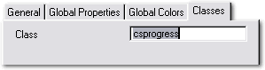 Class
Class
You can specify your own class to use for the progress control,
by default the csprogress class is used.
Shading Options
Shading options allow you to change the way the colors
selected are applied, depending on the shading option selected you can
create a variety of different shadings:
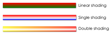
Left to right shading or top to bottom shading only: This creates a
progress bar shaded between the two colors (Linear Shading). Specifying a
x-percentage when using left to right shading will create single shading.
Specifying a y-percentage when using top to bottom shading will also
create single shading. You can create double shading by specifying a
y-percentage with left to right shading and an x-percentage with top to
bottom shading. The intensity option allows you to specify how bright the
highlight is. The range is 0 to 100, 50 is not very intense at all, and
100 is pure white. The intensity is sensitive in increments of around 20,
so for example 50 and 55 are very close in intensity, whereas 50 and 80
are quite noticeably different.
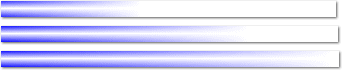
Vertical Shading (left to right) - single and double shading at 100%
intensity:
 Single Shaded Progress Bars
- Top Color and Bottom Color were set the same in the first bar and
two different blues in the second.
- Y-percentage was set to 50 and intensity to 60 and 100 (top and
bottom examples).
- Setting the cylinder end depth to any number greater than zero would
turn these into cylindrical single shaded bars.
Double Shaded Cylinder bar
- Top Color and Bottom Color were set to random bright colors.
- X-percentage was set to 50 and intensity to 100.
- Cylinder end color was set to the same as top color.
- Cylinder end depth was set to 20

Note that cylinders can only be drawn with a shading type that draws the
highlight down the length of the cylinder, so top to bottom shading with
no highlight, or left to right shading with a highlight (ypercentage >
0).
See the section on
Progress Control Styles for a
full description of the different types of progress controls possible.
Options for the Progress Control (The local
control template)
These options can be set after placing a progress
control on your window and choosing to populate it using the CapeSoft
Progress template, as described in
Adding Progress to
Your Application. The available options are identical to those
available on the Global Extension, with the exception of the option to
apply Progress to all progress control in your application , and the
option to disable progress throughout the application (which are only on
the Global Extension). See the section on the
Global
Extension for more information.
Right click on the Progress control and choose click on "Properties", then
click on the "Actions" tab, here you can customize the Progress control's
settings, such as giving the progress object a name.
General Tab
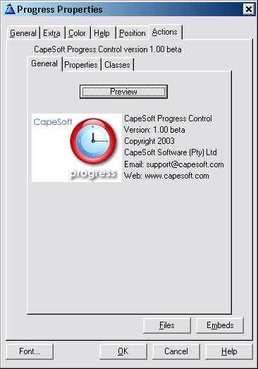
Preview
The preview button allows you to set all the control setting and to see
the changes in real time. The available settings are identical. When you
click OK in the previewer the setting are saved, and are reflected on
the Properties tab.
Properties Tab
RangeHigh and RangeLow
The maximum and minimum values for the progress control. By default
these are set to zero and 100.
Orientation
The direction the progress control should increment in. The options are
progress:right (the default),
progress:left,
progress:up or
progress:down.
See the section on
Types of Progress Bars for
information and examples of the effects of the various settings.
Pulse Bar
Changes the Progress Control into a "Pulse" bar. Setting this to 1 will
override any other settings that might apply (shading and incremental
setting will be ignored).
Pulse Width
The width of the "Pulse" that runs down the pulse bar.
OneSided
Specifies that the pulse bar only fades to the one side.
LeftColor
Basic color for the bar, also used as the left hand color in shaded
bars.
RightColor/TopColor/BottomColor
Colors used for shading
xpercentage/ypercentage
Horizontal and vertical percentage across the bar for the highlight on
shaded bars.
intensity
The highlight intensity on shaded bars.
startColor and endColor
The start and end colors for bars which change color as they progress,
setting these to values other than -1 will override any shading options
specified.
depth/eColor
Depth specifies the depth of the ellipse on the end of cylinders
(if this is -1 or zero then the bar will not be drawn as a cylinder),
the ellipse will be drawn in eColor. Note that cylinders can only be
drawn with a shading type that draws the highlight down the length of
the cylinder, so top to bottom shading with no highlight, or left to
right shading with a highlight (ypercentage > 0).
setBoxLine
By default a line is drawn in startColor around incremental
progress bars, setting this to 1 will ensure than no line is drawn
around the bar.
blockBar
Breaks the current bar into blocks (like the normal Windows progress
bar):
Block bars use the shading settings to draw the bar once and then copy
it block by block from a hidden Draw layer. If you change the shading
options manually (i.e. you are handcoding the progress bar) make sure
that you set the progress.
barDrawn property to
0. You can easily make bars that look like XP bars on all versions of
windows:
The leftColor and rightColor were set to 4766553, intensity was set to
60 and ypos to 30, blockBar was set to 1 and the default blockLength an
blockGap were used.
blockLength
The length of each block if blockBar is greater than zero (in pixels).
blockGap
The gaps between each block for block bars (in pixels)
Classes Tab
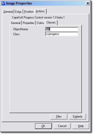 ObjectName
Specify the name of the object to use, Progress will automatically
populate this for you, although you can change it if you prefer.
Class
The class that Progress uses, you can replace the default Progress class
with your own class, as long as it supports the same same methods and
properties as the default class. This setting allows you to create child
classes that inherit from the base Progress class.
The Preview Button

The preview button allows you to set all the control settings and to see
the changes in real time. The available settings are identical to the
normal template settings. The "Show Help" tickbox displays the help pane
on the right when checked and hides it when unchecked.
Progress Bar Styles
You can achieve a large variety of progress bars using
the options provided by the template. The best way to find out just what
Progress can do is by using the
Preview button
on the
General tab. This allows you to see your
change in real time. Bear in mind that some settings override all others,
in the following order:
- Pulse bar - when this is checked no other shading or bar type
effects apply.
- Color change bar - when Start Color and
End Color are specified no other bar or
shading options will have an effect
- Cylinder bars (specified by Ellipse Depth and Color)
- Shaded bars - setting x percentage or y percentage will draw a
double or single shaded bar. Clear both of these to use linear
shading.
Range
RangeHigh and RangeLow need to be set regardless of the type of bar you
are using.
Orientation
Orientation determines the direction that the bar progresses toward, and
applies to all types of bars. The options are
progress:right (the default),
progress:left,
progress:up and
progress:down.
Pulse Bars
Pulse bars create a "pulse" that fades from a center color to the
background color and moves along the progress bar. The color can be
specified in the
Color field when the
Shading Option
radio button is set to
None on the
Colors tab. When
"pulse bar" is checked on the "General" tab a pulse bar will always be
drawn, regardless of any changes to the settings on the "colors" tab. To
draw any other type of progress bar untick the "pulse bar" checkbox. Check
the "One sided" box to only draw the fade on the end of the "pulse", so
the front edge of the pulse does not fade into the background.
Shaded bars
Shaded bars can be shaded top to bottom or left to right (regardless of
whether the bar is horizontal or vertical). They come in a number of
varieties:
- Linear shading from one color to another - accomplished by setting
the left and right colors or the top and bottom colors. In addition
the Shading Options group allows you to use "Single Shading" and
"Double Shading"
Single Shading
Single shading, shades the bar from one color to another but with a
highlight in the middle (the position of which you can specify using the
xpercentage and ypercentage fields), and the intensity of which you can
specify by using the intensity field. If the shading is left to right
specify a ypercentage for the highlight, if the shading is top to bottom
specify a xpercentage.
Double Shading
Double shading, shades from one color to another with a highlight
shaded in the opposite direction to the color shading. If the shading is
left to right specify a xpercentage for the highlight, if the shading is
top to bottom specify a ypercentage.
A nice effect is to use double shading with one color set to white. This
makes the bar appear to fade into the background as it progresses:
Cylindrical Bars
Cylindrical bars are shaded bars where an
ellipse
color (red in the example below) and
ellipse
depth have been specified. Instead of a standard shaded bar, a
shaded cylinder is drawn. Note that cylinders can only be drawn with a
shading type that draws the highlight down the length of the cylinder, so
top to bottom shading with no highlight, or left to right shading with a
highlight (ypercentage > 0).
setting
depth = 8 and
eColor = color:red on a double
shaded bar (leftColor, rightColor and ypercentage and intensity
specified):
Color Change Bars
Color change bars fade from one color into another as they progress,
simply specify a
Start Color and
End
Color to use a Color Change bar.
Important: If you change the startColor and
endColor yourself after the call to progress.Init() you will need to set
the progress.init property to zero. This will force the progress object to
recalculate the color increments with the new colors you have specified.
Example:
if myBarStyle =
1
myProgress.startColor = color:red
myProgress.endColor = color:green
else
myProgress.startColor = color:blue
myProgress.endColor = color:lime
end
myProgress.init = 0
Block bars (Windows style progress bars) The blockBars setting
allows any shaded progress bar to be broken up into blocks - similar to
the default windows progress controls. To use blockBars set the
blockBar
property to 1. The width of each block is specified by
blockLength,
and the gap between blocks by
blockGap.
Block Bars are also very efficient as the shaded bar is only drawn once,
and each block is then simply copied off a hidden Draw layer. This results
in a significant speedup, especially with double shaded bars. You can also
create bars that look like the Window XP bar under any version of Windows.
See the progress Demo example app for examples of XP look bars.
Resizing the Progress control
When Progress replaces the Clarion progress control it
sets its width and height to zero. In order for Progress to be able to
tell that the control needs to be resized the Draw control created at
runtime by progress needs to be resized, at which point Progress will
update itself. Note that progress will keep track of the position of the
Clarion control as well as whether it is Hidden and update the Progress
control accordingly.
You can do this manually simply by using progress.control
property to access the control Progress is actually drawing to:
thisProgress.control{PROP:Width} = 100
thisProgress.control{PROP:Height} = 10
Bear in mind that the progress.control property is the handle of a
standard Clarion image control, so the units will be the current units
being used on the target window (dialog units by default). In order use
pixels you should set the target{PROP:Pixels} = 1, for dialog units set
target{PROP:Pixels} = 0 (the default for Clarion windows).
Class Methods
By default you can simply specify a Use variable for
the progress control, in which case you will not need to call any methods
manually. You can call SetProgress() manually, which updates the control
and redraws it. You will also need to call SetProgress() if you need to
update the control inside a tight loop.
SetProgress
SetProgress (long progress)
Parameters:
| Parameter |
Description |
| progress |
progress: A value to set the current to progress to. The value
should be between RangeHigh and RangeLow. If this parameter is
omitted the current Use attribute will be use, if
{PROP:Progress} is being updated manually, the Use attribute
will be zero and the value of {PROP:Progress} will be used. |
Example:
thisProgress.SetProgress(50)
If the RangeHigh and RangeLow are left as the defaults (The default
RangeHigh is 100 and the default RangeLow is 0), then SetProgress(50)
will set the progress bar to halfway and display it.
Init
Init (long
control)
Description:
Initializes the Progress control by calling the Draw Init() method. You
should not call this. If you are hand coding you will need to call
ReplaceControl().
Parameters:
| Parameter |
Description |
| control |
The handle to the progress control to use for progress
control. ReplaceControl (long
controlHandle)
Replaces the Clarion progress control with a CapeSoft Progress
control and calls Init(). |
Kill
Kill()
Description:
Destroys the Progress control, called by the template when the window
closes. Unless you are hand coding you don't need to ever call this
method.
Class Property Reference
| control |
|
The control property allows you to access the runtime properties
of the Progress control that is being drawn to. When using PROP to
get the runtime properties of the control, do no use the Clarion
control handle, for example:
myWidth = ?myProgress{PROP:Width}
may return the incorrect value for the width of the control.
Instead you should use the thisProgress.control
property to access runtime properties. Example:
progressWidth =
thisProgress.control{PROP:Width}
progressXPos = thisProgress.control{PROP:Xpos}
If you set the PROP values using the Clarion progress control
handle then the Progress object will update itself, and in doing
so may overwrite the properties of the Clarion control. This only applies to {PROP:Width}, {PROP:Height},
{PROP:Xpos} and {PROP:Ypos}.
|
|
| baseControl |
|
This is the handle of the Clarion progress control being
replaced by the CapeSoft Progress control. |
Other Properties:
You can set these simply by right clicking on the control and
choosing "actions", or setting the options under Global
Properties. However for completeness the class properties are
listed below. |
| rangeHigh |
long |
The maximum value of the progress control. |
|
| rangeLow |
long |
The minimum value of the progress control. |
|
| orientation |
byte |
The direction that the control draws in, can be set the
following values:
progress:left
equate(0) progress:up equate(1)
progress:right equate(2) progress:down equate(3)
|
|
| leftColor |
long |
The shading color on the left hand side of the bar |
|
| rightColor |
long |
The shading color on the right hand side of the bar |
|
| topColor |
long |
The shading color at the top of the bar |
|
| bottomColor |
long |
The shading color at the bottom of the bar |
|
| bottomColor |
long |
The shading color at the bottom of the bar |
|
| startColor |
long |
This is the start color of progress bars that shift color from
startColor to endColor as they progress. When startColor or
endColor is set a incremental control is always drawn, to draw a
shaded bar starColor and endColor should be cleared to -1
(color:none). |
|
| endColor |
long |
The final color to shift towards. |
|
| depth |
long |
The depth of end ellipse of the cylinder. |
|
| eColor |
long |
The color of the end ellipse of the cylinder. |
|
| pulseBar |
byte |
If this property is non zero then a pulse bar is drawn. |
|
| pulseWidth |
long |
The width of the "pulse" that moves along a pulse bar progress
control. |
|
| pulseWidth |
long |
The width of the "pulse" that moves along a pulse bar progress
control. |
|
| oneSided |
byte |
Whether the "pulse" fades to the background color on one of
both sides. Default is that oneSided = 0 and the pulse fades into
the background on both sides, setting oneSided = 1 will only fade
the pulse bar towards the "back" of the pulse - the edge facing
the direction of forward movement will be a hard edge with no
fade. |
|
| setBoxLine |
byte |
If setBoxLine = 1 then a color changing bar has the box line set
to the current color each time it is drawn, if setBoxLine = 0 then
the box outline is drawn in the StartColor. |
|
| barDrawn |
byte |
Used by when drawing bar types that draw the entire bar once.
For example blockBars draw the entire shaded bar to a hidden Draw
layer and copy each block as necessary. If the shading options are
changed the barDrawn should be set to 0. |
|
Version History
Download latest version
here
Version 1.36 24 May 2021
Version 1.35 (7 September 2020)
- Change: Derived From DrawClass, not Draw. Requires Draw Build 4.22.
Required For Clarion 11.0.13622 .
Version 1.34 (18 October 2019)
- Add: Support for Resize and Split.
Version 1.33 (18 September 2018)
- Add: Clarion 11 to install.
Version 1.32 (23 October 2015)
- Fix: Template could generate two Initialization blocks of code in
Legacy Process and Report procedures.
Version 1.31 (21 October 2015)
- Add: Multi-DLL Legacy example
- Fix: Process procedures in Multi-DLL Legacy generated a compile
error.
Version 1.30 (25 February 2015)
- Installer supports Clarion 10
- Removed unnecessary calls to %cwversion
Version 1.29 (6 November 2014)
- Updated the Properties-Preview window, and made it available in
later Clarion versions.
Version 1.28 (22 January 2014)
Version 1.27 (18 June 2013)
- Fix: "Variable %ObjectName is not defined"
- Fix: %ObjectName is multi instance
Version 1.26 (7 June 2013)
- Update: Implement 4.03 of cape templates.
- Fix: Error: variable %illegalChar is not defined in Legacy apps.
Version 1.25 (24 May 2013)
- Update: Implement 4.02 of cape templates.
- Fix: Could get errors with %ObjectName in some apps.
Version 1.24 (25 April 2013)
- Updated examples to include Draw extension.
- Rebuilt install to support Clarion 9.
Version 1.23 (14 March 2013)
- Changed to Ver4 object/template management system. IMPORTANT
READ
THIS.
- Add: support for Multi-Proj in C8
Version 1.22 (30 October 2012)
- Clarion 7.3 / 8 compatible install.
Version 1.20 (10 November 2008)
- Clarion 7 compatible install.
Version 1.19 (30 March 2006)
- Updated template support for multi-DLL applications.
- New Multi-DLL example application.
- Updated support for Draw and Progress in Multi-DLL applications.
Version 1.18 (14 April 2006)
- Template Fix (for Clarion5) - undefined template function #Pdefine
omitted.
- Template Fix - removed font properties in template prompts where
necessary.
Version 1.17 (23 February 2006)
- Updated for 2.26 release of Draw.
- Clarion6 versions use same name DLL (i.e. c60cspx.dll) for
previewing.
Version 1.15 (09 June 2005)
- Updated for 2.14 release of Draw.
- New Template options - cleaned up template interface and buttons,
changed labelling to to clearer and more consistent, added C6.2
compatibility.
- New Previewer DLL - compiled in standalone mode to reduce the size
by about 70%
- Redesigned Previewer DLL interface.
Version 1.14 (11 January 2004)
- Updated for the 2.13 release of Draw.
- Supports the new DrawDLLMode template option to assist in using Draw
and Progress in a DLL for multi DLL projects (will be fully documented
in a later release).
Version 1.13 (23 November 2004)
- Based on new version of Draw.
- Fixed problems with the Progress Previewer not working.
Version 1.12 (02 November 2004)
- New optimizations to the Progress class.
- Fixed compatibility problems with the Previewer DLL and some builds
of Clarion 6.
- Standardized template interface.
- Fixed bug with black bars being displayed when Progress replaces
standard Clarion controls and the progress variable has not been
incremented (no call to the Progress.Display() method).
- Changed code order in the SetProgress method.
Version 1.11 (04 November 2003)
- Fixed a typographic error in the template that resulted in an
"Uknown variable %CP" when the Global Preview button was pressed in
Clarion6.
- Updated documentation, added sections on Updating
Progress Inside a Loop and Optimising
Progress, as well as new entries in the FAQ.
- Changed default bar type to blockBars to improve performance.
Version 1.10 (28 October 2003)
Version 1.05 Beta (17 September 2003)
- Progress automatically resizes and redraws itself when the Draw
control's size has changed - see "Resizing the Progress Control"
- BlockBars now draw the last block even if the entire block would not
fit, so the bar always reaches the very end of the progress control.
Version 1.04 Beta (09 September 2003)
- Added blockBar progress bar types. These are fast, allow all shading
types and can create Windows XP style bars under all version of
windows.
- Fixed bug in previewer which could pass the incorrect parameters
back to the template.
- Added new help tabs to previewer with more detailed help and example
images of the bar types.
- Allows the thickness of the preview bar to be adjusted within the
previewer using a spin control.
- Changed class structure.
- Added examples of the new bar types to the Demo example that ships
with Progress.
- Moved call to SetProgress() in CPCS reports to avoid bug that
printed out blank records in the detail band (ABC only).
Version 1.03 Beta (02 September 2003)
- Added support for CPCS report and process procedures (ABC and
Legacy).
- Added support for Clarion 6 CR-1 and recompiled C6 previewer DLL.
Version 1.02 Beta (19 August 2003)
- Updated documentation
- Removed black dot drawn on top left hand corner of the progress
control.
- Fixed resizing issues.
- Documented class properties that allow access to the control
handles.
- Added help on main window with tick box to hide it.
- Improved real-time previewer and added help.
Version 1.01 Beta (12 August 2003)
- Added support for Legacy report procedures
- Added support for Legacy process procedure
Version 1.00 Beta (05 August 2003)
- First release of CapeSoft progress.
License & Copyright
This template is copyright 2019 by CapeSoft Software. None of the included
files may be distributed. Your programs which use Progress can be
distributed
without any royalties.
Each developer needs his own license to use CapeSoft Progress. (Need to
buy
more licenses?)
This product is provided as-is. Use it entirely at your own risk. Use of
this
product implies your acceptance of this, along with the recognition of the
copyright
stated above. In no way will CapeSoft Software, their employees or
affiliates
be liable in any way for any damages or losses you may incur as a direct
or indirect
result of using this product.