


www.capesoft.com
Updated 20 June 2011

| NetTalk WebServer - Adding Web Server Functionality to your Application | |||
|
|
|
||
|
|
|||
| Version
www.capesoft.com Updated 20 June 2011 |
|
||
 |
 |
 |
 |
|
 |
 |
 |
|
Learn
NetTalk
|
Examples
|
Common
Features |
NetAuto
Objects |
NetSimple
Objects |
Dial-Up
|
Support
|
Version
History
|
 = recommended reading
 Summary
 1. Add the Activate NetTalk Global Extension, and the Activate Web Handler Global extension to your application.
2. Add a WebServer procedure to your application.
3. Add a WebHandler procedure to your application.
These three steps are sufficient to build a web server that will serve static web pages from your web folder. However you may also add more procedures, based on the other NetWeb procedure templates if you want to. These templates will be explained in more detail later.
Each of these three mandatory steps is discussed in more detail below.
 1.
Global Extension Templates
1.
Global Extension TemplatesIn order to use the NetWebServer functionality in your application you need to add two global extensions to your application.
Tip: If you’re new to Clarion, you add Global extensions by going to the Application menu, Global Properties option, or by clicking on the GLOBAL button on the toolbar.
Click on the Extensions button.
First add the Global Extension called “Activate CapeSoft’s NetTalk”.
Then to that add the second global extension, called “Activate NetTalk Web Server”.
There are no global options available regarding the Web Server functionality.
2.
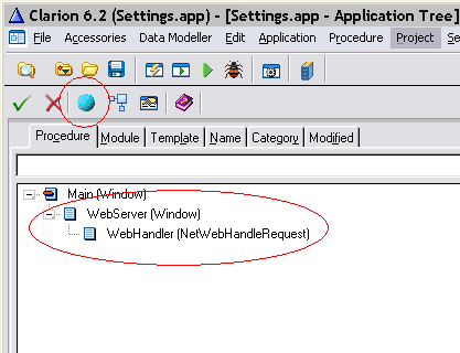
Add a WebServer procedure to your applicationThere are a number of ways to do this.a. Run the Import utility (Application menu, Template utility option, Select ImportNetWebServer). This imports the Web Server and WebHandler procedures. OR
b. Simply import a WebServer window from an existing application, such as one of the examples. Go to the File menu, choose Import From Application, and select one of the example applications. Then select the Web server procedure and import it. OR
c. Alternatively, make a new procedure, based on the Window template. To this window add a NetTalk object (using the “Include NetTalk Object” Extension.) On the extension set the ThisObjectName to ThisWebServer (or anything else you like) and set the Base class to NetWebServer.The settings for this extension are described below. Optionally add the “NetWebServer Logging Controls” Control template to the window.
3.
Add a WebHandler procedure to your applicationAs before there are a number of ways to do this.a. If you did step (2a) just now, then a WebHandler has already been added to your app. OR
b. Import from an example. OR
c. Create a new procedure, for example called Webhandler, based on the NetWebHandleRequest procedure template. Use the one listed on the Defaults tab and most of the hard work is done for you.
d. Make sure the procedure prototype is set to
(String p_String)e. This procedure also has a “Include NetTalk Object” Extension template. Set the object name to ThisNetWorker, and the base class to NetWebServerWorker. The settings for this template are explained in more detail below.
Settings
for the NetWebServer Base ClassWhen you use the NetTalk “Add NetTalk Object” extension, and set the base class to NetWebServer, then you will see a number of settings appear on the settings tab.
The settings on the settings tab are in turn placed on one of four sub-tabs.
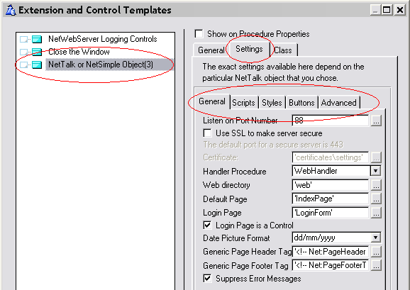
General
SettingsListen on Port Number: This determines the port number that this web server is listening on. Only one program can listen on a specific port at a time. The default port for public web servers is 80, but this will only work if there is no other web server installed on the machine (running on port 80.) You are free to use any port number, but numbers above 1000 are usually considered safe. When accessing your server from a remote machine, if the port is not set to 80, then you will need to specify a port number. For example if you are accessing a server on 192.168.1.1, on port 88, then the URL for that looks like this;
http://192.168.1.1:88If you wish to listen on multiple ports then add multiple WebServer objects to the window, each listening on a different port number.
The default port for Secure Sites (ie using SSL) is 443.
Use SSL to make the server secure: If you want this object to be SSL enabled then tick this option on. See the document Building Secure Web Sites for more information on SSL sites.
Certificate: If you make a secure site you’ll need a certificate. The document Building Secure Web Sites covers getting, and installing, certificates in a lot more detail.
Handler Procedure: Select the Handler Procedure that belongs to this WebServer procedure. This is the procedure you created in Step 3 above. If you have multiple WebServer procedures then you can share Handler Procedures. (i.e. one Handler procedure can support multiple WebServer procedures.)
Web Directory: If left blank the the default is WEB. This is the directory, usually under the application directory, where the web files (HTML and so on) can be found. It’s possible that your app has no external files, but it’s more likely that you’ll want to have at least some static files. The Styles, and Scripts directories, are by default, sub-directories of this folder.
Default Page: This is the first page of your site, the one people get if they don’t enter a page name. A typical site sets this to ‘index.htm’ or ‘default.htm’. Of course you then need a page with that name.
Login Page: If your site contains pages visible only to users that are logged in, then set this to be the name of your Login page. That way, if a user attempts to access a restricted page, and is not logged in, then they will be redirected to the login page.
Login Page is a control: You may use the NetWebForm template to create your login page. If so then tick this option on.
Date Picture Format: Use this to set the default date format for your site. The default is dd/mm/yyyy but an alternative is mm/dd/yyyy.
Generic Page Header Tag:
Generic Page Footer Tag:
It’s is possible to create browses and forms and source procedures in your app. These are usually used as controls on a page. However they can also be used as pages in their own right. When they are it’s possible to specify a common header, and/or footer (source) procedure that can get generated around the page.
These settings are in the form of tags. For example;'<!-- Net:PageHeaderTag -->' would use a procedure called PageHeaderTag.Default Page Title: For those pages that do not have a Page Title, you may enter a default Page Title here.
Suppress Error Messages: This is on by default, and I recommend leaving it on. When you make server software you don’t want error messages popping up on the (server) window, and halting the server. If you are having TCP/IP problems then tick this off to see what they are.
Scripts
SettingsInclude HTML Editor: If this is on then the JavaScript for a WYSIWYG Html text editor will be included in the JavaScript for your site.
Scripts Directory: Leave this blank to use the default (web\Scripts) or specify your own value here.
Scripts: Add any JS files that your site requires here. The files shipped with NetTalk do not need to be added here, they are automatically added for you.
Styles
SettingsDefault Form Style: Select the default Form Style from the drop down list. There are currently 4 supported styles;
Plain
Rounded
Tabbed
Outlook
Default Browse Style: Set the name of the CSS Class that you want to be used as the default BrowseStyle. Id this is set to Custom, then enter the name of the class int he following field.
BrowseClass: The name of the custom, Browse CSS class to use.
Default Prompt Class: Enter the name of the default class to use for the Prompt column on NetWebForm procedures.
Default Body Class: enter the default CSS class to use for the <body> on your pages.
Styles Directory: Leave this blank to use the default (web\Styles) or specify your own value here.
CSS Style Files: Add any CSS files that your site requires here. The files shipped with NetTalk do not need to be added here, they are automatically added for you.
Browse Colors: You can set the default Browse bar colors here. The mouse-over, green bar, and Selected colors can be set.
ButtonsOn this tab you can specify the default settings for the different types of standard buttons in your web application. For each button you are able to set the:
Text: This is the text that will appear to the end user.
Image: this is the image that will appear on the button.
Image Width, Height and Alt: These specify the attributes of the image.
Button Class: This is the CSS class that will be applied to the button.
Tooltip: the tip that will appear when the user hovers over the button.
Note: For internet Explorer it is possible to make a button containing an Image by using CSS. A number of built-in classes are available in MSIE.CSS which contain examples of this. Example 23 has good examples of using these button settings, with various classes and images, to get graphics on buttons, and buttons (with graphics) as items in a Browse.
Advanced
SettingsAlways redirect to Secure Site: If your web server procedure has 2 NetTalk WebServer objects. (One secure, and one not-secure). And this is the Non-Secure object. Then you can redirect all requests on this object to the secure object. Use this switch when you want a completely secure site, but you also want to listen on a port (for example, port 80) for unsecure traffic.
Bind Server to only IP: Allows you to set the server so that it only responds to requests that arrive via a single netweork connection. Set this to 127.0.0.1 to force the user to use the browser on this machine. (Good for Service interfaces.) Or set it to the LAN address to restrict access only to the LAN. You can read more about this feature in the document Building Secure Web Sites.
Combine common files: The JavaScript, and CSS files that NetTalk uses are gleaned from various sources. Combining them into a single file (all.css and all.js) is more efficient for the browser when it gets the files. However if you are experimenting by editing individual files, then you'll need to turn this off.
Serve pre-compressed files: The JavaScript and CSS files have been pre-compressed using gzip. These make for smaller files, and will automatically be served to the browser if the browser is set to allow compressed files.
Session Timeout: The browser is Stateless, meaning it does not remember anything from one page to the next. It is up to the server to do all the remembering, and it does this for each user by allocating the user a unique Session ID. If the user does not interact with the server for a pre-determined amount of time (ie this setting) then the session variables for that session are removed.
Charset: By default web sites use the 'ISO-8859-1' character set, however if your web site is in a language other than English you may want to use an alternate charset.
Translations - Locate: Enter the preferred text to use on the locator.
Settings
for the NetWebServerWorker Base Class
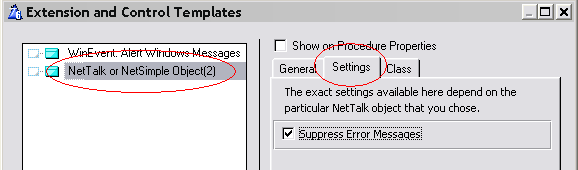
Suppress Error Messages: This is on by default, and I recommend leaving it on. When you make server software you don’t want error messages popping up on the (server) window, and halting the server. If you are having TCP/IP problems then tick this off to see what they are.
Settings for
NetWebPage Procedure templateThe NetWebPage procedure template is the base template for HTML pages that you want to include in your app. (your server can also serve static pages off the disk.)
The procedure settings can be accessed via the NetWebPage Settings button.
There are also a number of extensions that can be added to this page – these extensions will be discussed in more detail later in this document.
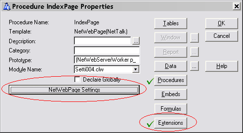
Click on the NetWebPage Settings button to see the settings for this procedure.
General
TabPageName: When linking to this page from other procedures in your app you may use the procedure name directly without any extension. However if you wish to use an alternate name then enter the Page Name into this field. This field cannot contain a variable or expression, and so does not need quotes. For exampleIndex.HtmPage Title: In HTML pages can have a title – which is not displayed on the page itself, but can be used by the browser (and search engines) to describe the page. Enter the title here if you want one. For example‘NetTalk WebServer Example Site’
Page Type: Usually a page is of type HTML (ie suitable for a browser) but it may also be one of the other common types served over HTTP, including XML, PDF or other. If set to Other then you can set the Content-Type of the page manually.
Scripts
TabEnter the names of any custom Script files (.JS files) used by this page. You do not need to add the files NetTalk ships with, and you do not need to add any files entered on the Scripts tab of the WebServer settings.
CSS
Class
TabEnter the names of any custom Style files (.CSS files) used by this page. You do not need to add the files NetTalk ships with, and you do not need to add any files entered on the Styles tab of the WebServer settings.
You can also override the page <body> class on this tab.
xHTML
TabFor both options you can enter;Use this tab to enter HTML snippets onto the page. Snippets entered here will automatically be “encoded” into Clarion in a Routine. The page is then put together from one or more snippets. You can also "embed" other NetWebSource procedures in your page by using this tab.
Embed: You can select to embed another procedure (usually a NetWebSource procedure) or a Routine (containing HTML) at this point.
If you select Procedure then you can enter;
Procedure Name: The name of the procedure to embed.
Parameters: any parameters required by the procedure. NetWebSource procedures always have the p_web as the first parameter, so this is the default. Brackets are not required in this field.
Return Value: If the procedure returns a value, and you want to store the returned value in a variable, then enter the variable here.
If you select Routine then you can enter;
Routine Name: The name of the routine this snippet will end up in.
HTML: The HTML itself can be cut & pasted from any visual web page editor.
Condition: Surround the call with a condition. If the condition evaluates to True then the Routine or Procedure will be included. This is ideal if you want to base the call on some condition, like for example the fact that the user is logged in (or out).
Location: Enter the location where you want to embed the call.
Note that you don’t need to put the whole web page in here. Just HTML that would normally reside inside the <body> </body> tags. All the rest of the page, such as the header, will be generated for you.
Advanced
TabUser must be Logged in: Tick this on if the user must be logged in to view this page. If this is on attempts to go directly to this page, without logging in will redirect the person to the Login page.
User must be >= Level: The user must be at this level, or higher, to view this page.
User must be >= Level: the user must be at this level, or lower, to view this page.
Only Serve IF: An expression that lets you limit who can see this page.
Only Server is Secure SSL: This page is only accessible via the Secure SSL port. If this page is requested via the unsecure port, then the request will automatically be re-routed to the secure port.
No <body> tag: In most cases your page should have a Body tag. However in very special cases you may prefer to code this in yourself. In that case tick on this option. Using the FrameSet extension template automatically suppresses the body tag.
JavaScript onLoad: You can enter JavaScript code here that will execute when the page is loaded into the browser.
Settings
for the Frameset Extension TemplateThis template can be added to NetWebPage procedures. It generates the html code for a FrameSet for you. Before using this make sure you understand Frames just a little, and read the introduction to Frames in the document Webserver Basics.
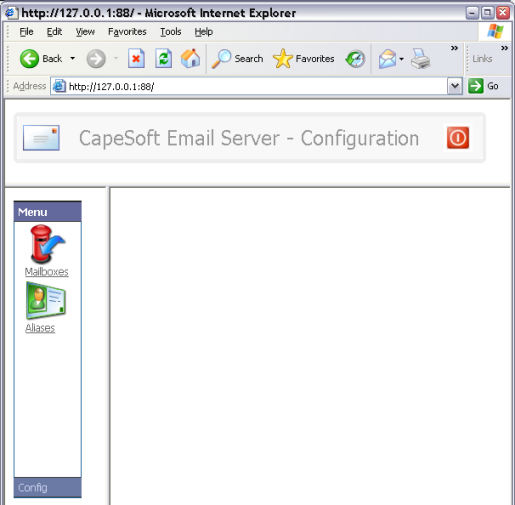
Frames allow you to split the web page up into different areas, and treat each area separately. For example in Example 4 the page is split up like this;
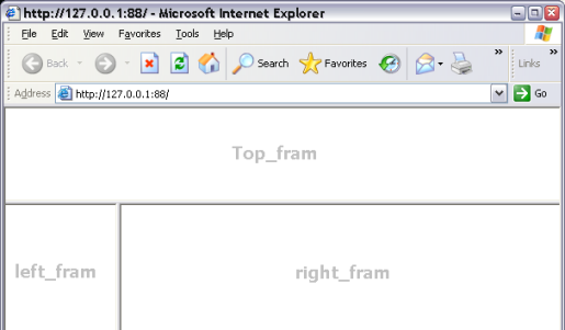
Example 4, FrameWithMenu, contains an example procedure with a FrameSet extension. The procedure is called FramePage.
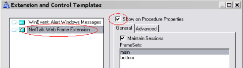
Tip: When adding this extension tick on the option right at the top called Show On Procedure Properties. This will put these settings on the Window Properties page, where it is easy to get to them.
General
TabEach item consists of either a Frame, or another Frameset.Maintain Sessions: This make sure that the Session ID is passed on the various links that are generated. Unless your site is completely static leave this on. And even if it is completely static leaving it on is a good idea.
FrameSets:
Name: This the name frameset you make. The name is important, and case sensitive. I use names like top, and bottom, or left and right and so on.
Rows: Enter the number of rows into which this Frameset will be divided.
Row Sizes: Enter a comma delimited list of the row sizes here. Use either a specific number, or a *. Entering ‘100,*’ means that the first row is 100 units high, and the second is whatever is left. If you had 3 rows then you could enter ‘100,100,*’ or ‘100,*,*’ or even ‘*,*,*’’.
Columns: Sames as rows, but indicates the number of columns.
Column Sizes: Same as Row sizes.
Contents: These contain the contents for the FrameSet. The number of items here Must match the number of panes in your frame set. Ie Rows * Columns. (Where a blank value is treated as 1). The contents are assigned first by row, then by column.
Frameset Name: If another Frameset then enter the name of the frameset here. This must match the name of another frameset as defined in the list of frameset. Don’t use any quotes, and remember it is case sensitive.
Frame Name: If the Item is a frame then enter the frame name here. Use something simple you’ll remember because later on you’ll direct pages using this frame name. Don’t use quotes here.
URL: When the Framset page is opened each frame is immediately filled with a default page. Enter the default URL for this frame here. Use quotes. Use the name of another NetWebPage if you like. (But still put it in quotes. For example ‘PageHeader’.
Scrolling: Set the scrolling option for this frame. Auto places scroll bars in the frame only if the content is bigger than the frame. No supresses all scroll bars, and Yes always has scroll bars even if the content fits in the frame. The recommended value is Auto.
Frame Border: Tick this on if you want the Frame to have a border. Borders are necessary if you want to support resizing.
Allow resizing: Allow this frame to be resized. In almost all cases you should allow resizing, unless for some reason you want to fix the size of a frame.
Left/Right Margin: The margin space to be used on the left, and right, side of the frame.
Top/Bottom Margin: The margin space to be used on the top and bottom of a frame.
Advanced
TabText if browser doesn’t support Frames: Enter HTML here that will be visible to the user if frames are not supported. This may be an error message, (example: Bummer – Frames not supported) or an alternate index page for your site; for example:
<!—Net:IndexPageNoFrames -->
Settings
for the WebBorder Extension TemplateThe WebBorder extension template allows you to wrap some html in a fancy border.
A good example of using this template is in example 1, BasicBrowseAndForm, in the PageHeaderTag procedure.
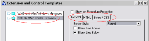
General
TabBorder style: If set to round then the border has rounded corners. If set to plain then it has square corners. Note that the classes set on the Styles / CSS tab set the colors of the border.
Blank Line Above: Includes a space above the border after the previous part of the page.
Blank Line Below: Includes a space below the border before the next part of the page.
HTML
TabThis is the HTML that will be included inside the border. It does not include the border itself.
Routine Name: The name of the routine that will be generated to contain the HTML code.
Condition: A condition that specifies whether the HTML will be included or not. If the condition exists, then it must evaluate to TRUE for the HTML to be included.
HTML: The HTML to include.
Styles
/ CSS TabThis tab allows you to change the CSS styles that will be used. You can read more about CSS in the document NetWebServer CSS.
Outer Div Class: Set this to the class to use for the outer DIV. A rounded border itself is made up of 2 DIV areas, with potentially different colors. The default for this class is ‘headingouterdiv’.
A plain border only has one DIV. (The Outer Div.)
Inner Div Class: Set this to the class to use for the inner DIV. The heading for this class is ‘headinginnerdiv’.
Settings
for the WebMenu Extension TemplateMenu Style: There are currently 2 different menu styles supported by this template. The first is a drop-down Windows style menu. The other is an Outlook style menu.
For an example of the Windows style menu see example 2, BasicWithMenu, PageHeaderTag procedure.
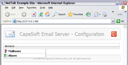
For an example of the Outlook style menu see example 4, FrameWithMenu, MenuOnLeft procedure.
Maintain Sessions: Tick this on to maintain the session number when menu items are called.
Blank Line Above: Thick this on to add a blank line above the menu on the page.
Blank Line Below: Tick this on to add a blank line below the menu on the page.
Menus: Each menu consists of multiple items.
Menu: the name of the menu on the menu bar.
Menu Condition: An optional condition. If it exists, and it evaluates to true, then the menu is included.
User must be logged in: Tick this on if the user must be logged in in order to see this menu.
URL: Enter a URL here if the menu itself is clickable, and there is no drop-down for this menu. This is only available in the Windows Style menu.
Target Frame: If the URL is entered, and you want to specify a target frame, then enter it here.
Items: Each menu will consist of 1, or more items. (If a URL is entered for the menu itself, then menu items
are not allowed.)Display: The text to display for the menu item.
Item Condition: An optional condition which (if it exists) must evaluate to True in order for the menu item to be displayed.
User must be logged in: The user must be logged in to see this menu item.
URL: The URL to go to if the menu item is selected. This can be a procedure name in the app, or an HTML page name. For example;
‘MailboxesBrowseControl’ or
‘Somepage.Htm’
Target Frame: If your site has multiple frames, then enter the name of the target frame here. Target frame names are case sensitive. The page the user has chosen will appear in the target frame. If this is left blank then the page will appear in the current frame. You can enter an expression here, so use quotes if you are entering a specific frame name. For example;
‘left_fram’
The names of the frames are set on the FrameSet extension template, in the Frame Name. Note that when setting the frame name quotes are not used.
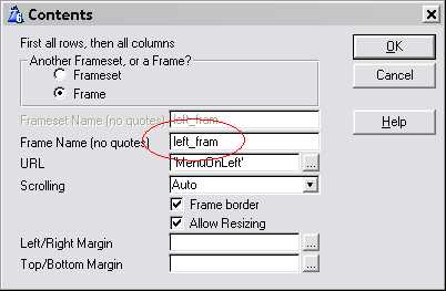
Image: Enter the name of an image here.
Image Width: Enter the width of the image.
Image Height: Enter the height of the image.
Image Alt: Enter the alternate text for the image, if applicable.
Styles
/ CSS tabWindows Style
Drop Menu: Set the style to be used for the drop-down menu. Default is ‘DropMenu’.
Outlook Style
Outlook Menu: Set the style to be used for the Outlook style menu.
Title: Set the style for the title bar of the menu.
Content: Set the style for the content part of the menu.
Settings
for the NetWebGraph Extension templateNote: This extension allows the use of Insight Graphing graphs in your WebServer application. Insight Graphing is not included with your NetTalk purchase. For more information on Insight Graphing visit the CapeSoft web page
http://www.capesoft.com/accessories/isgsp.htmAn example of using this extension is example 10, BasicGraph.
This extension is designed to be attached to a normal Window procedure, onto which an Insight graph has been populated.
The procedure must have the p_web parameter declared as:NetWebServerWorker p_web
or
<NetWebServerWorker p_web>
There are no extra settings for this extension. All the settings for the graph are done, as normal on the Insight extension. The size, and shape, of the Insight control on the window dictates the size, and shape, of the graph on your web page.
Settings
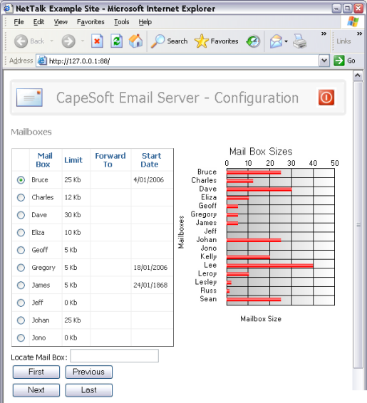
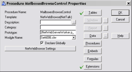
for the NetWebBrowse Procedure TemplateThe NetWebBrowse procedure template allows you to make a Browse Control, which you can then embed on a page. You can also call the procedure directly, which will wrap the control in a generic page.
A good example of the Browse template is in example 1, Basic Browse and Form.
The procedure must have the prototype
(NetWebServerWorker p_web)
The procedure must have the Declare Globally option ticked on.
The settings for the browse are accessed via the NetWebBrowse Settings button.
The table being browsed, as well as the initial sort order, are set under the Tables button.
General
TabBrowse Heading: An optional heading for the browse.
Blank line after Heading: Check this on to generate a bit of blank space after the heading.
Allow xHTML in Heading: By default the heading is "encoded" to make it valid xHTML. If you tick this option on, then you can include actual HTML in the heading, but you are responsible to make sure it is valid xHTML.
Browse Subheading: An optional subheading for the browse.
Blank line after Sub-heading: (See Blank line after heading above.)
Allow xHTML in Sub-heading: (See Allow xHtml in Heading above.)
Message If Empty: If there are no records in the browse then this text will be displayed.
Page Name: By default you can use the procedure name as a URL to bring up a generic web page containing the Browse control. However if you want the client to see the address as, say an HTM name, then you can fill in a page name here. For example, if the Page name is set to ProductsBrowse.Htm and the site links to ProductBrowse.Htm then this browse control will be served, wrapped in the generic page.
Page Title: If this control is called as a page, and hence is wrapped in the generic page, then you can set the title of the generic page by using this field.
Unique, Unchanging, Key: When calling a form it is important that a Unique, unchanging, Key be used to identify the record being changed. Enter the key here. If this field is left blank then the Primary key will be used. Not that which ever key is used the fields that make up this key should not be included on the Form itself.
General Tab:
Type: The browse column can contain either a String or a Button.
Field: The name of the field being displayed in the browse column.
Use Equate: Each column in the browse needs a unique Use-Equate name. This defaults to the name of the field, but you can enter an alternate name if the field appears multiple times.
Description: A description of the column. This is only used internally on the template list, and not in generated code.
Display: An optional expression that overrides the Field value. Use this when you want to display an Expression, and not a single field.
Picture: A picture for the field. The picture field is primed from the dictionary, so having a correct dictionary saves a lot of work here.
Header: The text that should appear in the header for this column.
Header Tooltip: The text that will appear when the user hovers the mouse over the header, but does not click it.
Header spans multiple columns: Tick this on if this header covers not this column, but 1 or more subsequent columns as well. Some columns (for examples columns with buttons) do not need a header, so having more space for the previous header is advantageous.
Span Columns: The total number of columns that this header will span.
Column Condition: If a condition exists here, and it fails, then the whole column will be suppressed, regardless of the individual cell conditions.
Column CSS Class: Enter an optional CSS style for this column here. Use the drop-down to select from a selection of common styles, or select Custom to enter a custom css class for this column.
Custom CSS Class:
Enter the custom CSS class for the column here. Remember you can use
multiple classes be entering them as a space-separated list. Also remember
that CSS is case sensitive. For example
'Bold NoWrap' adds the Bold and NoWrap
styles to this column.
Allow xHTML in column: By default HTML is not allowed in the browse columns, and the text in the column is encoded so that it conforms to xHTML standards, and so that any injected-html will not display. However if your variable contains HTML, and you want it to "work" as HTML, then tick this option on. Note that if the code is not valid xHTML then this will break some of the browse functionality (most notably, sort headers, next & previous buttons, locators and so on.)
Column Width (pixels): Suggests a minimum column width to the browser for this column. The browser may opt to make the column wider.
Field Tooltip: Text to display when the user hovers over a cell, in this column, in the browse. Note that this expression is evaluated on a row by row basis, which allows you to include additional row information as a tooltip in the browse.
Last On Line: If this option is ticked then subsequent browse columns will start again from the left hand margin. In this way a single set of browse columns can occupy multiple lines in the browse table. See the MultiRow (50) example for an example of this approach.
Data Spans multiple columns: In the example mentioned above you'll see that the first row in the browse contains a number of columns, whereas the second row spans across all the columns. This field (Data Spans multiple columns) is used in conjunction with the Last On Line setting above to organize the layout of multi-row browses.
Span Columns: Enter the number of columns to span here. The default (loc:columns) contains the calculated maximum number of columns for the browse so far.
Edit Tab:
Allow Edit in Place: If this field is checked then the browse will allow the user to edit the data in this column. For the most part the various settings mirror the options you will see on a form. The field type, various field settings and so on are all consistent with the settings on a form. Thus the documentation here is aimed at the differences between Edit-In-Place and a Form, rather than their similarities.
The most obvious difference is that there is no Save button on a browse row. Changes are saved on a cell-by-cell basis. As soon as the user completes a cell, it is saved into the database on the backend. Only fields in the browses primary file are saved automatically, edits on secondary files must be saved in embed code. The Tagging (48) example shows how a secondary file (in this case a tagging file) can be updated. It also is a good example of using EIP to tag records in a browse.
Tip: Some form field types, most notably the checkbox, can be visually more appealing than displaying a 0 or 1 in a column. By turning EIP on for the column, then selecting checkbox, then setting the EIP condition to (for example) false, the browse can contain a unchangeable checkbox column.
EIP Condition: If this condition fails, then the field, on this row, will not be editable by the user.
Sort Tab:
This tab determines the sort order, and override locator options, for the browse column.
No sorting on this column: Tick this on to suppress header-sorting for this column.
This column is the default sort order: Tick this on to make this column the default sort order for this browse, if the user has not selected some other sort order. If multiple columns have this option ticked, then the first visible column with the tick will be used as the default sort order. (Columns may be suppressed, and hence not visible.)
Custom Sort Order (+): This allows you
to enter a custom ascending sort order for this column. This expression will
be used as-is as the prop:order for the
browse's View. All the usual rules for setting a view prop:order should be
observed. Particular attention to the CASE or NOCASE of strings should be
noted. For example;
+UPPER(emp:site),+UPPER(emp:empnumber)
or
+UPPER(inv:customer),+Inv:Date
Custom Sort Order (-): If a custom ascending sort order has been entered, then a custom descending sort order is also required.
Case Sensitive Sorting: This field only applies if there are no Custom Sort Orders. It allows you to make a String column Case Sensitive. By default string columns are treated as case in-sensitive.
Locate On Field: If you have entered a custom sort order, then enter the locator field here. this does not necessarily have to be the first field in the sort order, although that is usually the case.
HyperLink Tab:
Link to Form (Change Mode): If this is on then the browse cell will contain a hyperlink to the Form procedure. The action for the form will be set to Change. This is an alternative to using an inline Change button on the browse row. Note that the Change Condition on the Form tab for this browse (ie the Form options for this browse) applies to this hyperlink as well as to any change buttons on the browse.
Field contains URL: Tick this on if the field in this column is a URL. Ticking this on makes the URL clickable. If you tick this on you can also set the target. A good option in most cases is to set the target to '_blank' which opens a new browser tab.
Field contains Email Address: Tick this on if the field contains an email address. This will make the address clickable. However be wary of displaying email addresses on web pages, especially public web pages, as these can easily be scraped by Spammers.
URL: Allows to enter any expression (including using other fields from the browse table) which makes the text in this cell clickable.
Target: Allows you to set the target for the click. If this is set to '_blank' then a new tab will open in the browser.
Image Tab:
This tab allows you to set an image to appear in the cell. The image can be overridden (and hence not appear) if images on the Conditional tab are used. The image will display to the left of any text that appears in the cell.
Conditional Tab:
This tab allows you to override the contents of a cell depending on external conditions. For example you may want an image to show whether an employee is in, or out. You could use this tab to set the condition, and also the image to display.
Totaling Tab:
This tab allows you to set totaling options for this column. You can override the style of an individual total by entering it into the style field. However if you want to change the style of all the totals then set it on the CSS Classes Tab.
If any of the browse rows have a total, then a Total Row will be added to the foot of the browse table. Note that at this time only the displayed rows are totaled. If the browse is page loaded then this only totals this page, not the whole browse.
Just like the header, the totals can span multiple columns.
Security Tab:
User must be logged in: The user must be logged in in order to view this column.
User must be >= Level: The user must have at least this level in order to view this browse column.
User must be <= Level: The user must have a lower level in order to view this browse column.
Must be Secure SSL: This column is only visible if being served in a Secure page.
General Tab:
Use Equate: Each browse column requires a unique Use Equate.
Description: A description of the column. This is only used internally on the template list, and not in generated code.
Action: Sets the action for the button. There are a range of built-in buttons with built-in behavior (for example Change and Delete) but you can also create custom buttons by setting the Action to Other.
Properties Tab:
Some of these fields are only visible if the button action, on the previous tab, is set to "Other". Fields only visible when the action is "Other" are marked with a *.
Type: * Set the button type to either Button or Submit. A Button is used when you don't want to replace the whole web page. Use this for running Server-Side code, or for client-side effects, or for opening an unrelated URL in another tab. A submit button requires a URL, and will fetch a whole new page from the server.
Text: The text that will appear on the button.
Name: * The button requires an HTML name. For example 'other_btn'.
URL: * The URL of the page to go to.
Target Frame: * The Frame for the URL to go to. Set this to '_blank' to open a new tab in the browser.
URL contains Email Address: * Tick this on if the URL is an email address.
Include Row ID Field: * If this is on, then the row id is included as a parameter of the URL. The row id is the component of the Unique, Unchanging Key for the browse. You can get the value of this parameter, in the page you are going to, by using p_web.GetValue('whatever').
Include Action: * Even though you are making a custom button, you may be going to a form. The form needs to know the desired action, and this is passed via this field. Typical actions include Insert, Change, Copy and Delete - however you can also specify that the button name be passed as the Action.
Image: Image Width: Image Height: Image Alt: These settings let you specify the image that will appear on the button.
CSS Class: The CSS Class for the button. (Tip: If you are making your own CSS Class for the button, then be aware of the buttonTable class which is required as well. For example, in the shipping netweb.css file, the SmallButton class is acompanied by a SmallButtonTable class.)
Tooltip: The tooltip to display when the user hovers over the button, but does not click it.
Disabled IF: * An expression that allows you to disable the button on a row-by-row basis.
Column Properties Tab:
Header: The header of the column.
Header Tooltip: The tooltip to be displayed when the user hovers over the header but does not click it.
Header spans multiple columns: Tick this on if this header covers not this column, but 1 or more subsequent columns as well. Some columns (for examples columns with buttons) do not need a header, so having more space for the previous header is advantageous.
Span Columns: The total number of columns that this header will span.
Column Condition: If a condition exists here, and it fails, then the whole column will be suppressed, regardless of the individual cell conditions.
Column CSS Class: Enter an optional CSS style for this column here. Use the drop-down to select from a selection of common styles, or select Custom to enter a custom css class for this column.
Custom CSS Class: Enter the custom CSS
class for the column here. Remember you can use multiple classes be entering
them as a space-separated list. Also remember that CSS is case sensitive.
For example
'Bold NoWrap' adds the Bold and NoWrap
styles to this column.
Column Width (pixels): Suggests a minimum column width to the browser for this column. The browser may opt to make the column wider.
Last On Line: If this option is ticked then subsequent browse columns will start again from the left hand margin. In this way a single set of browse columns can occupy multiple lines in the browse table. See the MultiRow (50) example for an example of this approach.
Span multiple columns: In the example mentioned above you'll see that the first row in the browse contains a number of columns, whereas the second row spans across all the columns. This field (Data Spans multiple columns) is used in conjunction with the Last On Line setting above to organize the layout of multi-row browses.
Span Columns: Enter the number of columns to span here. The default (loc:columns) contains the calculated maximum number of columns for the browse so far.
Client side Tab:
This tab only appears if the button is an "Other" button. For optimal use of client-side functionality, the button type should be BUTTON, and the URL field should be clear. If the button is a submit, or if there is a URL, and there is Client-Side settings, then 2 requests will be made to the server. The order of these requests being received is not predictable (and can be browser dependant), and equally the order with which the requests are processed is even less predictable.
OnClick (JavaScript): This field allows you to enter custom JavaScript for the button.
Send Button Click to server: If this is on then the server will receive an event when the user clicks on the button.
Server Code: This is a good embed point to embed code which should run, on the server, when the button is pressed. At this point in the code the primary record of the browse row has been loaded, and copied into the session queue.
Refresh browse cell DATA after server code runs: If you tick this on then the browse cell (containing the button) will be refreshed in the browse after a click. This is most useful when the Disabled state of the button may change by it being pressed.
Refresh browse row data after server code runs: This option means the entire browse row will be updated when the button is pressed. However since only the primary record has been loaded this can result in browse fields, from secondary files, being cleared. You will either need to load secondary records manually.
Refresh whole browse after server code runs: Use this option if the entire row will be removed, or if changes to other browse rows (or the browse total) will occur.
Reset other columns in the same row: This allows for finer grained control than the options above. Conceptually it fits between refreshing jsut the current cell, and refreshing the whole row.
Filters
TabFilter: Enter an optional view filter here. Use this to limit the number of records that will be used in the browse. See also the Locator Type (on the options tab) and the Runtime Filter tab (Fields area) for additional ways to limit the records on the browse.
Conditional Filter: Conditional Filters allow for a completly alternate range and filter to be used if some condition exists. One of the conditions you can use is to determine if this browse is being used as the child of another browse, or form. This allows you to easily re-use the same browse procedure in different parts of your web site.
Hot
Fields TabEnter additional fields here that you want to be included in the VIEW structure. Only fields in the view can be reliable used in any hand-code you may embed on the browse.
Form
TabShow Buttons: Tick on the various buttons that may appear under the form. If allowed, the Select and Cancel buttons will only appear when the browse has been called as a Lookup. The Insert, Change, Copy and Delete buttons will not appear when the browse has been called as a lookup.
Select Condition: Enter a condition here that must be matched in order for the Select button to appear when the browse is called in Lookup mode.
Select / Cancel URL: In most cases, when called in lookup mode, a browse should go back to the form. This is the default behavior if this field is blank. However you can enter a custom URL in here if you wish to go somewhere else.
Button Position: Use this to determine the position of the Insert, Change and Delete buttons. The position can be either above, or below the browse, or both.
Selection Method: Allows you to determine if browse rows should be highlighted using a windows-style highlight bar (and allows you to select a row by just clicking on the row) or whether the browse should have a radio button on each line. The highlight method is the default, and the recommended option.
Call form only if Logged In: If this option is on, and the user is not logged in, then the Insert, Change, and Delete buttons will not be displayed.
Call Form only if Level <=: This allows you to make the Form "User Level" dependant. If the user is not of a sufficient level then the Insert, Change, Copy and Delete buttons will not be visible.
Form Control Procedure: Enter the name of the form procedure here.
Advanced:
Form URL: If you leave the Form Control Procedure blank you can link directly to a URL. This allows you to hand-code a custom form.
Form Target: Allows you to specify that the form will open in a separate frame (if the site is using frames.)
Locators
TabLocators are only available for Page-Loaded, Server-Side-Sorted browses (see Options tab). They allow the user to automatically jump to a specific place in the browse. The Locator field is automatically changed whenever the sort field is selected.
Template Settings:
Default Sort Order: Enter the default sort order here. You should only use this option if one of the columns is not the default sort order. If you want a column to be the default sort order then set the option on the Sort tab for that column.
Default Locator Field: If the Default Sort Order is set then you can optionally enter a default Locator field here. If the browse should open with no locator, then leave this option blank.
Field Description: This field is required if you enter a Default Locator Field. It forms part of the text for the "Locate whatever:" prompt displayed to the user. Use quotes around a fixed value, or use an expression here.
Locator Position: Select the position of the Locator to be either above or below the browse, or both.
Locator Type:
Select either a Position,Range or a Contains locator.
A position locator loads
the table at the closest place to the locator selected. The user can
then scroll up, or down, through all the records.
A Range locator
limits the records to those that match the Locator.
For example: If a range
locator is selected, and the user enters RED as the locator, then only
records starting with the letters RED will be displayed. Redfern,
Redvers and Redza would all be visible. However no other records will
be visible.
A Contains locator is
similar to a Range locator, but the locator string can exist anywhere in
the field. So if the contains locator was set to RED then agredible,
redder, and corred will all be visible.
Table Blank until
Locator entered: Especially useful on the Range and Contains
locators. If this is ticked then no records are returned in the browse
if the locator is not filled in.
Message waiting for:
Enter the message that will be displayed to the user if no records are
being displayed because the system is waiting for a locator to be
entered.
Include Search Button: Some users are more comfortable seeing a Search button to the right of the locator field. The button is not necessary because the locator automatically locates when you tab off the locator field, however it is included here if you'd like a button for the user to click on.
Include Clear button: A clear button clears the current locator (in the case of Contains, or Begins-With locators.) This is functionally equivalent to the user physically deleting the text in the locator field and pressing tab.
Additional Information:
If a Contains, or Begins-With locator has been selected, and the user sorts
on a Numeric, or Date column, then the locator type automatically changes to
be a Positional locator for that column.
All the locator settings can be set at runtime using whatever criteria you
prefer. The Locators
(49) Example shows how the locator options can be manipulated in
embed code. In that example all the various options are presented to the
user on a form, and the settings from that form used to alter the settings
for the browse.
Locator
settings can also be set on the column level - see the Sort tab for the
browse column for the options that are available.
Options
TabThis tab covers various options regarding the Browse behavior.
Greenbar: Tick this option on to have a greenbar effect occur on the browse. This typically alternates the row color of the browse rows to create a visually pleasing effect. (The colors for the greenbar can be set globally in the WebServer procedure, or locally on the CSS Classes tab.)
MouseOver: Tick this on to have a mouse-over-highlight on the browse row. Like the green bar the color of this mouseover can be set on the CSS classes tab, or globally in the Web server procedure.
Highlight Selected: Tick this on so the currently-selected-row in the browse has a distinct background color.
Show Column Headings: Tick this option on to include column headings on the browse.
Loading Method: Set this to File or Page. File loaded browses display all the records, regardless of the file size. This is ideal for small files. Page-loaded browses only show a fixed number of records at one time. This is faster, and more appropriate, for tables with a large, or indeterminate, number of records.
Records per Page: If set to Page-Loaded, this determines the number of records displayed on the page.
Include Blank rows: If set to page-loaded, this forces that the number of records be consistent, even if there is insufficient data to fill those rows.
Allow Unfilled: If this is off, and the end of the file is reached, but the browse table is not completely full, then the table will be read in reverse order, from the end, to display a consistent number of records. Ticking this on may gain slight performance benefits, but at the expense of a browse that may contain a variable number of rows.
No Sorting: The browse cannot be resorted by the user. The initial sort order still applies though.
Client Side Sorting: The user can resort the table based on the column headings. The sort is done by the browser itself, and data is no re-fetched from the server. This sort is ideal for file-loaded browses. TIP: Client Side sorting is not recommended at the moment.
Server Side Sorting: The user can resort the table based on the column headings. The sort is done on the server, and the browser re-fetches the visible page. This sort is suitable for page-loaded, or file-loaded browses.
Table Width (pixels): A specific width for the whole browse table in Pixels. This is however only a suggestion to the browser, and the browser may choose to make the table wider than this.
xHTML TabUse this tab to enter HTML snippets onto the page. Snippets entered here will automatically be “encoded” into Clarion in a Routine. The page is then put together from one or more snippets. You can also "embed" other NetWebSource procedures in your page by using this tab.
Embed: You can select to embed another procedure (usually a NetWebSource procedure) or a Routine (containing HTML) at this point.
If you select Procedure then you can enter;
Procedure Name: The name of the procedure to embed.
Parameters: any parameters required by the procedure. NetWebSource procedures always have the p_web as the first parameter, so this is the default. Brackets are not required in this field.
Return Value: If the procedure returns a value, and you want to store the returned value in a variable, then enter the variable here.
If you select Routine then you can enter;
Routine Name: The name of the routine this snippet will end up in.
HTML: The HTML itself can be cut & pasted from any visual web page editor.
For both options you can enter;
Condition: Surround the call with a condition. If the condition evaluates to True then the Routine or Procedure will be included. This is ideal if you want to base the call on some condition, like for example the fact that the user is logged in (or out).
Location: Enter the location where you want to embed the call.
CSS
Classes TabOn this tab you can set the CSS styles that will apply to this browse.
Styles are accumulative, so you can have multiple styles assigned to a single item, using a space-separated list. For example, the default browse table style is 'BrowseTable'. This style allows the text inside browse cells to be wrapped. However if you set the style to 'BrowseTable NoWrap' then the data in the browse cells will not be wrapped.
This tab also lets you override the colors for the browse Greenbarring, Highlighting, and Mouseovering features.
Children
TabBrowse procedures are allowed to have child procedures. Child procedures are either other browses, or NetWebSource procedures. They can be arranged to the right of the parent browse, or below the parent browse.
Condition: Children can be conditional, and thus only visible to certain users, or when this browse is used at certain times.
Suppress child if this browse is blank: Typically the child is related to the currently-highlighted browse row. So by default if there is no rows in the parent browse (this browse) then the child is suppressed.
Suppress child if this browse is called as a lookup: If this browse is called in lookup mode, then the children can be suppressed.
Procedure: The name of the child procedure (must be NetWebBrowse or NetWebSource procedure.)
Position of Child: Either to the right, or below, the current browse.
Advanced
TabUser must be logged in: The user must be logged in for this browse to appear. If the browse is on a generic page by itself, then the user will be redirected to the login page. If the browse is included as a tag on a bigger page, and the user is not logged in, then the browse control is simply not included.
User must be >= Level: The user must be greater than a specific level in order to view this browse.
User must be <= Level: The user must be less than a specific level in order to view this browse.
View-Only mode IF: Allows the user to view the browse, but no Form buttons (Insert, Change, Copy, Delete) will be visible.
or level >: Puts the browse in view only mode if the level is higher than a certain value.
Only Serve IF: If this condition fails, then the user cannot see the browse.
Only serve if Secure SSL: The connection must be on a secure port. If not, and a secure port exists, then the request is automatically redirected to the secure port.
Page Header Tag: Allows you to override the global PageHeaderTag for this procedure. The page header tag is usually of the form <!-- Net:SomeProcedureName --> where SomeProcedureName is the name of a NetWebSource procedure. However it could be <!-- Net:f:Filename --> where Filename is the name of a file in the web folder (containing some fixed html code).
Page Footer Tag: Allows you to override the global PageFooterTag for this procedure.
Allow View Button even if Change button exists: By default the user will see either the Change button or, if the browse is in View-Only or Lookup mode the View button. If you wish the user to see the View button, even if a Change button exists, then tick this option on.
Multi-Record Rows: Implicit in each browse is the idea that 1 record in the data file = one record on the browse. However NetTalk Web Server allows for multiple records to appear on the same line of the browse.
Start new Row When: Enter an explicit row-breaking condition here.
When Row Starts: Optionally enter HTML code here to include at the front of every row in the table.
Session Variables: The template can create local variables for you, and copy the current contents of the Session variable into the local variable.
Variable: Enter the name of the Session variable here. The local variable will be created with the same name, but with the LOC: prefix. For example a session variable called EmployeeName will be created (and primed) as LOC:EmployeeName.
Variable Type: Enter the Type of the Variable here (String, Long etc). If no type is entered then the variable will be made with the type STRING(255).
Timer (1000ths/sec): Allows you to put a timer onto the browse page. Caution: Use timers very carefully. If the user leaves the browser open on this page then the timer keeps going. If the user accidentally leaves his browser on this page say over a weekend then the bandwidth costs on both ends can be significant.
Refresh: If the timer is set then you can determine the nature of the browse refresh. Does it start at the top of the browse, jump to the bottom (the most recent records) or remain in the current position.
Ignore Key not being Unique: By default the template checks to be sure that the Unique Unchanging Key on the General tab is in fact a unique key. If it is not a unique key you'll get a warning when the browse generates. If you wish to use this key regardless of the warning, then you can tick this option on to suppress the warning.
Settings
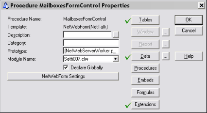
for the NetWebForm Procedure TemplateThe NetWebForm procedure template allows you to create a Form Control, which you can then embed on a web page. You can also call the procedure directly, which will wrap the control in a generic page.
A good example of the Form template is in example 1, Basic Browse and Form.
The procedure must have the prototype(NetWebServerWorker p_web,long p_action=0),long,proc
The procedure must have the Declare Globally option ticked on.
The settings for the form are accessed via the NetWebForm Settings button.
General
TabForm Style: This allows you to override the Default Form Style for the web server. Typically you would not set this unless you were overriding the global style. (The global style is set in the WebServer procedure, Extensions, NetTalk object, Settings Tab, Styles tab, Default Form Style.)
Form Source: Select either File or Memory.
File: The name of the file that is being changed.
Unique, Unchanging, Key: In order for forms to work, you need to have a Unique Unchanging Key for the table. The fields in this key must NOT be on the form.
On Save when Inserting: Select either Return to Browse, or Insert Another.
Form Heading: The heading for the form (optional).
Allow xHTML in Heading: By default the heading is "encoded" to make it valid xHTML. If you tick this option on, then you can include actual HTML in the heading, but you are responsible to make sure it is valid xHTML.
Blank line after Heading: Check this on to generate a bit of blank space after the heading.
Form Subheading: The subheading for the form (optional).
Allow xHTML in Sub-heading: (See Allow xHtml in Heading above.)
Blank line after Sub-heading: (See Blank line after heading above.)
URL on Save/Cancel: By default the form will go to the place it came from (usually the Browse). If you wish to go somewhere else then enter the URL here.
Target Frame: If you want the Save / Cancel button to link to a page in another frame then specify the Frame name here.
Page Name: By default you can use the procedure name as a URL to bring up a generic web page containing the Form. However if you want the client to see the address as, say an HTM name, then you can fill in a page name here. For example, if the Page name is set to ProductsForm.Htm and the site links to ProductForm.Htm then this form control will be served, wrapped in the generic page.
Page Title: If this control is called as a page, and hence is wrapped in the generic page, then you can set the title of the generic page by using this field.
Fields
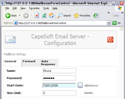
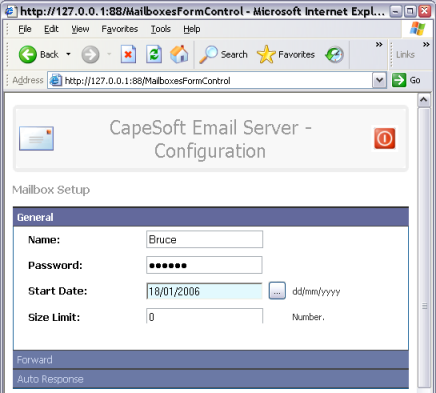
TabTabs: Each form contains one, or more, “tabs”. The actual presentation of these tabs depends on the form style used
Heading: The heading of the tab.
Tab Condition: An optional expression for this tab. If the expression evaluates false then the tab is suppressed from the form.
Tab CSS: The CSS Style for the tab.
Span Columns: Span the Prompt|Value|Comment columns, on this tab.
Fields: Each tab contains one or more fields.
Field: The name of the field being edited.
Use Equate: Each field on the form needs a unique Use Equate identifier. By default this is just the field name, but if the same field is on the form multiple times then give each one a unique name.
Type: The type of the field being entered. Valid types are STRING, DATE, TEXT, RADIO, CHECKBOX, DROP, FILE UPLOAD, DISPLAY, BROWSE, BUTTON and Hidden.
Prompt: The prompt that will appear to the left of the field, on the form.
Include Condition: An optional condition, which if it exists, must evaluate to True for the field to be displayed. If the field is Excluded then it cannot be unhidden dynamically.
Hide Condition: If this expression is true then the field is included on the form, but is invisible to the user. It can then be unhidden if necessary dependant on the values the user enters on other fields on the form.
Comment: An optional comment that will appear to the right of the entry field giving additional instructions. If not entered then some comments are generated automatically based on validation rules.
ToolTip: The tooltip that will be displayed when the user hovers over the field on the form.
Settings Tab:
The settings depend on the Type of field being entered.
Lookup button: (String & Text only). If this is on then the Lookup Settings tab will appear. A lookup button is placed to the right of the entry field, and takes the user (typically) to a Browse to select a valid value.
Height: (Drop only). Sets the number of lines that the Drop control will create when the user clicks on the "drop" icon.
Width (Pixels): (Drop only.) The width, in pixels, of the Drop control. By default the drop control will auto-size to the largest option, however you can override it using this setting.
Allow Multiple Selections: (Drop only.) If this is on then the Drop list displays as a complete list box, not a Drop list box. However it is only one column wide. the user can also select multiple rows using the normal Ctrl-Click and Shift-Click methods.
Read-Only Field: Tick this on if this field is set to Read-Only. Note that a DISPLAY field type may be more appropriate than an ENTRY field that is always Read-Only.
Read-only IF condition: An expression, which if true, results in the field being set as Read-Only.
True Value: (Checkbox only.) An expression containing the value of the checkbox control when set. The default if set in the dictionary is used. If the default is not set in the dictionary, or this is not a dictionary field, then the default is 1.
False Value: (Checkbox only.) An expression containing the value of the checkbox control when not set. he default if set in the dictionary is used. If the default is not set in the dictionary, or this is not a dictionary field, then the default is 0.
Layout Horizontally: (Radio only.) If ticked then the radio buttons will be displayed in a left-to-right format. If unticked the radio options will appear one below the other.
Radio Options: (Radio only.) Enter the various radio options for this control here.
Rows: (Text only.) The number of rows for the text control.
Columns: (Text only.) The number of columns for the text control.
Allow xHTML: (Text only) By default html is not allowed in Entry fields or Text fields. Tick this on to allow HTML in the text field. Caution: HTML injection can be a possible problem if this option is turned on. Tip: To use the built-in WYSIWYG HTML editor on the form, make sure the option to allows HTML editing, on the Web Server procedure, Scripts tab, is turned on.
Password Field: (String only). Tick this on if the entry field should "hide" the entry by masking the characters with * characters.
Right Justify: (String, Date only). Tick this on to make the entry field Right Justified.
Force User to use Lookup: (Date only). If on then the user has to use the supplied calendar pick list, and cannot enter the date manually.
Width (chars): (String, File Upload,Date only.) Set this to the number of chars that the entry field will display. The default is 20. This does not restrict the number of characters that will be acceptable, only the number that will be visible.
Picture: (String only) Enter the clarion format picture for the field here. For example '@n6.2'
Max Length: (String, File Upload, Text, Date only.) This restricts the number of characters that will be accepted by the entry field.
Procedure: (Browse only). The name of the browse procedure (built using the NetWebBrowse template) which will be embedded on the form here.
Parameters: (Browse Only). Custom parameters to pass to the browse.
Horizontal Line: (Display only). Places a horizontal line across the Prompt, Value, and Comment columns at this point in the form.
Button: (Display only). An obsolete setting, use the Type set to Button instead.
Span prompt/value/comment: If on then this form field spans the Prompt, Value and Comment columns of the form.
Last On Line: By default each form field is placed underneath the previous form field. In other words, by default, each one is the "Last in Line". If you want the next form field to appear to the Right of this form field, then untich this option.
Last In Cell: If you want the following field to appear inside the value column of this field, then tick this option on. This is most commonly the case when you have a custom button following an Entry field, and you want the button to appear right next to the entry field.
Allow Auto Complete: (String only) By default the browser auto-complete function is disabled for dynamic fields, and password fields. If the field is neither dynamic, nor a password field, then auto-complete for the field can be enabled.
Validate Immediately: (Radio, Checkbox only.) See Validation tab below.
Validation Tab
The settings on the validation tab depend on the type of form field being used.
The dictionary validation for the field is always evaluated as well, and when the Form is saved every field is re-validated. This includes fields that are in the Primary File Record, but not in the form. To be specific, even if a field is not included on the form, if dictionary validation exists for the field then the field will have to be valid, or the record will not be written to the disk.
Alert Message: The message to display if the validation fails on the field.
Required: The field cannot be zero, or blank.
Required If: The field is only required if this expression is true.
Numeric: The field must contain a numeric value.
Low: The numeric value must be greater than, or equal to, this value.
High: The numeric value must be less than, or equal to, this value.
Case: The entry field must use the following case. Note that if the user enters the wrong case, then the field is corrected, and sent back to the browser, but the field is not labeled Invalid.
Validate Immediately: This allows you to override the setting on the Form's Advanced tab on a field-by-field basis.
Lookup Settings Tab
This tab is only visible for Drop fields, and Entry fields with a Lookup button.
URL: (Lookup only.) The URL of the Browse procedure that will be called in lookup mode.
Target Frame: (Lookup only). The frame where the lookup will appear. This is usually left blank, or set to '_self'.
From File: The table which the browse will be doing a lookup on.
Filter: (Drop only.) A filter statement to limit the number of records in the drop-down.
Order By: Specify a sort order for the lookup or drop-down.
Value Field: The field in the remote table that will contain the selected ID value. This value is automatically copied to this FIELD. (ie it's copied to the field selected in the FIELD setting at the top of this template.)
Description Field: This is the field displayed in the drop-down itself.
Link File: (Drop only). This is used when a many-to-many relationship exists, and a Link file is used to link the parent and child files together. (The relationship must be set in the dictionary.)
Auto-lookup on Insert: (Lookup only) If this is on, and the Form is in Insert mode, then the form is not displayed. Rather the user goes directly to the lookup, and first selects the necessary field. the user then returns to this form, and continues as normal.
Force user to use lookup: The user cannot enter the code directly, they have to press the lookup button and select a valid entry from the browse. Tip: If this setting is off, and the user enters the code into the field then the comment for the field is updated automatically. Furthermore, if the child table has a key on the description field, then the user can enter the description directly into the entry field. The description will then automatically be moved to the comment field, and the correct code placed in the entry field.
Use Description instead of Value in Read-Only mode: (Lookup only.) If the lookup field is in readonly mode, and this is on, the the description is used in place of the code when displaying the value to the user.
More Assignments: (Lookup only.) Additional fields from the child table can be assigned to additional fields from the parent table.
More Settings Tab
This tab is only visible for Drop Fields. It allows you to add options to the drop list that do not come from a data table. You can add settings either before, or after the table. If the Drop has no table at all then all the possible options for the drop can be entered on this tab.
Hot Fields Tab
This tab is only visible for Drop fields. It allows you to add additional fields to the VIEW structure for the Drop field.
Text Tab
This tab is only visible for the Display field type.
Text: An expression containing the text to display.
Picture: A clarion picture to use to format the text.
CSS Class: A CSS Class to use for the text.
Allow xHTML: Allow the text to contain HTML. You are responsible to make sure the text contains valid xHTML. If it does not then various dynamic updates on the form may "break".
Button Tab
This tab is only visible if the field is a Button.
Type: The button can be of type Button, or type Submit.
Name: The button requires a name, for example 'mybutton_btn'.
Text: The text (if any) to display on the button.
CSS Class: The CSS class to apply to the button.
Default Button: If this is on, and the user presses ENTER on the keyboard, then this button will be pressed.
When clicked, Set Focus: This allows you to determine which field should be given the focus, after the user clicks on this button.
Image Tab
This tab lets you set the image parameters so that an image can be displayed. This tab is only visible for the Display field type and the Button field type.
Hyperlink Tab
This tab is only visible for the Display, and Button Field types. If the text, or image, or both of the field should be clickable, then the URL for the Display field can be selected here.
CSS Tab
Prompt Class: Enter the CSS class for the Prompt here.
Entry Class: Enter the CSS class for the form field here.
Comment Class: Enter the CSS class for the comment field here.
Entry Part: (Drop only.) Enter the CSS class, for the Entry-Field part of the drop list here.
Drop Part: (Drop only.) Enter the CSS class for the Drop-Part of the drop list here.
Client Side Tab
This tab contains the settings and code which governs what happens immediately when a user tabs off a field, or presses a button etc.
When field Selected in Browser: Enter details here for what to do when the user selects a field in the form. These options are seldom used as most activity occurs when the user Accepts a field.
When Field Accepted in browser: These actions occur on the JavaScript onChange event. In order for this even to be generated the form field must change, simply tabbing through the form fields, without changing them will not trigger this event.
Send new value to server: Tick this on to send the new value to the server.
Server Code: This is a good embed point to handle incoming change notifications from the client.
JavaScript hand-code: You can enter custom JavaScript here which will execute (in the browser) when the user accepts the field.
Reset: This allows you to reset other fields on the form when this field changes. You can reset either, or all of the Prompt, Value and comment fields. Of particualr interest here is unhiding fields by resetting all 3 (ie reseting the Prompt, Value and Comment) of the target field. Typically the target field is using the SessionValue of his field as the Hide condition.
Priming
TabUse this tab to prime fields when the form is opened.
Field: Name of the field to prime.
To: An expression that contains the value.
Only if field is not already set: Tick this on if the field should only be primed if it contains a zero (for numeric fields) or a blank string.
Prime for Insert: Prime the field if the form is in Insert mode.
Prime for Copy: Prime the field if the form is in Copy mode.
Prime for Change: Prime the field if the form is in Change mode.
Layout
TabTable Width (pixels): The form is designed as a table containing one or more columns. By setting this option you can suggest an overall width for the table to the browser. The browser may use a wider width though if it deems it necessary.
Span Columns: Tick this on so that the usual 3 column approach (Prompt|Value|Comment) is dropped, and the form fields exist in a single column. This can be useful for miniature forms (like Login pages) with only a very small number of fields.
Vertical: Usually the Form is generated in a horizontal format.Prompt : Value : Comment
In some cases it is good to generate it in a Vertical format.
Prompt
Value
Comment
An example of this is the LoginForm procedure in Example 4.
Prompt Width (pixels): A suggestion to the browser on how wide to make the prompt column. The browser may alter this
width if necessary.
Value Width (pixels): A suggestion to the browser on how wide to make the value column. The browser may alter this width if necessary.
Comment Width (pixels): A suggestion to the browser on how wide to make the comment column. The browser may alter this width if necessary.Suppress Comments: If you wish to suppress the comments column, then tick this option on.
xHTML TabUse this tab to enter HTML snippets onto the page. Snippets entered here will automatically be “encoded” into Clarion in a Routine. The page is then put together from one or more snippets. You can also "embed" other NetWebSource procedures in your page by using this tab.
Embed: You can select to embed another procedure (usually a NetWebSource procedure) or a Routine (containing HTML) at this point.
If you select Procedure then you can enter;
Procedure Name: The name of the procedure to embed.
Parameters: any parameters required by the procedure. NetWebSource procedures always have the p_web as the first parameter, so this is the default. Brackets are not required in this field.
Return Value: If the procedure returns a value, and you want to store the returned value in a variable, then enter the variable here.
If you select Routine then you can enter;
Routine Name: The name of the routine this snippet will end up in.
HTML: The HTML itself can be cut & pasted from any visual web page editor.
For both options you can enter;
Condition: Surround the call with a condition. If the condition evaluates to True then the Routine or Procedure will be included. This is ideal if you want to base the call on some condition, like for example the fact that the user is logged in (or out).
Location: Enter the location where you want to embed the call.
CSS
Classes TabOn this tab you can set the CSS styles that will apply to this form.
CSS Classes can be concatenated together using a space separated list. So, for example, the Main Heading class could be set to 'MainHeading Red' which would then assign it both the MainHeading class, and the Red class.
Advanced
TabUser must be logged in: The user must be logged in for this form to appear. If the form is on a generic page by itself, then the user will be redirected to the login page. If the form is included as a tag on a bigger page, and the user is not logged in, then the form control is simply not included.
User must be >= Level: The user must have a level equal, or higher, than this in order to see this form.
User must be <= Level: The user must have a level equal, or lower, than this in order to see this form.
View Only Mode IF: An expression, which determines if the form should be displayed in View-Only mode, or Editable mode.
Or Level >: If the user has a level greater than this, then the form will be displayed in View-Only mode.
Only Serve IF: A general expression that must be true, or the form will not be served to the user.
Only serve if Secure SSL: The connection must be on a secure port. If not, and a secure port exists, then the request is automatically redirected to the secure port.
Page Header Tag: Allows you to override the global PageHeaderTag for this procedure. The page header tag is usually of the form <!-- Net:SomeProcedureName --> where SomeProcedureName is the name of a NetWebSource procedure. However it could be <!-- Net:f:Filename --> where Filename is the name of a file in the web folder (containing some fixed html code).
Page Footer Tag: Allows you to override the global PageFooterTag for this procedure.
Include Save/Close button: Usually the form contains a Save or Close button. (The Save button appears when the form is in Editing mode, the Close button occurs when it is in View-Only mode.) However some forms are "Memory Style" forms so these buttons are not needed. For example, forms used as sophisticated selection criteria for an embedded form.
Include Cancel Button: If this is on then a Cancel button is included on the form. Tick this option off if the form will usually be part of a bigger page.
Include Delete Button: Deletes can be done directly off the browse, or you can choose to open the form and have the user click the Delete button. If this option is on then a Delete button is included on the form (when the user has clicked the Delete button on the browse.)
Prime Auto Inc if necessary: If this is a form, on a file, with an auto-incrementing key, then the auto-increment will occur before the form displays, but only if the template determines that it is necessary. The most common reason for it being necessary is that the form contains an embedded child browse. If the Auto-Inc is not necessary, then it will be done when the Save button is pressed, and the record is created.
Prime Auto Inc even if not necessary: If you tick this on, then the auto-Inc will happen when the form displays, even if the template does not think it's necessary to do it at that point.
Wizard Tab height (pixels): If the form is in Wizard mode then set the height of the Tab part of the form here. This height determines the position of the Next, Previous, Finish and Cancel buttons.
Ignore Key being not Unique: The form required a Unique, Unchanging, Key. If the key selected is not unique then a warning will be generated at compile time. To suppress this warning tick this option on.
Generate Automatic Comments: By default the comment field will contain a suggestion to the user based on the validation requirements for the field. This will only appear if the comment field, on the General tab, is blank. However if you wish to suppress automatic comments then turn this option off.
Auto Dict Validation: If this is set to Default, then the option is taken from the WebServer procedure. If this option is set to Yes, then each field on the form is validated immediately on the server as soon as the user enters it. This makes for a highly interactive form which leads to a very satisfying user experience. You can override this behavior on the field level, or you can turn it off for the whole form here.
Sound when Valid: Enter the name of a WAV file which will be played on the client computer when the field is valid.
Sound when not Valid: Enter the name of a WAV file here which will be played on the client computer when the user enters an invalid field.
Popup Invalid Message in Browser: By default when a field is invalid then a message will appear at the top of the form (typically in red) and the errant field will be highlighted. If you wish the error message to appear in a popup message box on the client PC as well then tick this option on.